Skip to content

2025

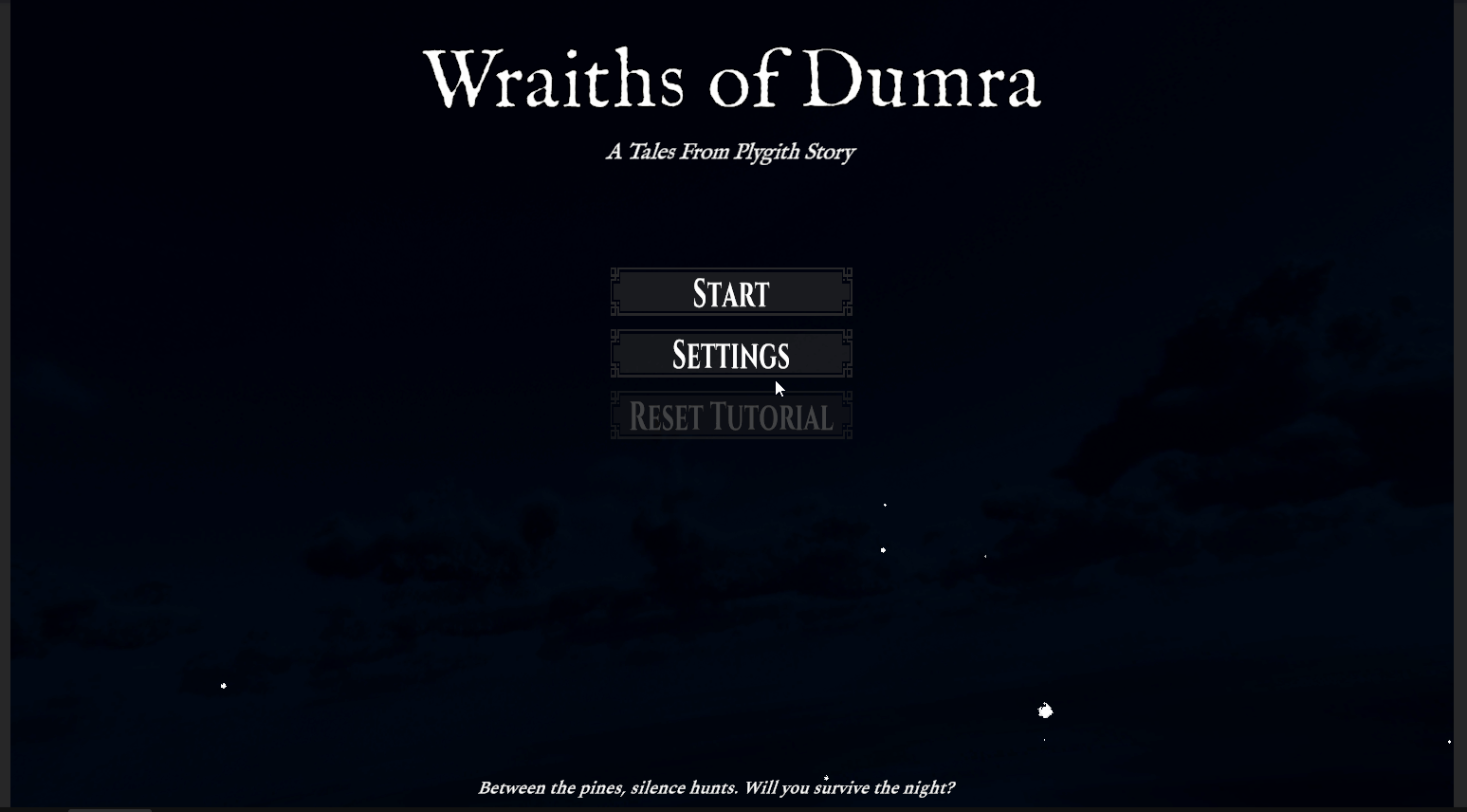
A Postmortem on My First Game Jam

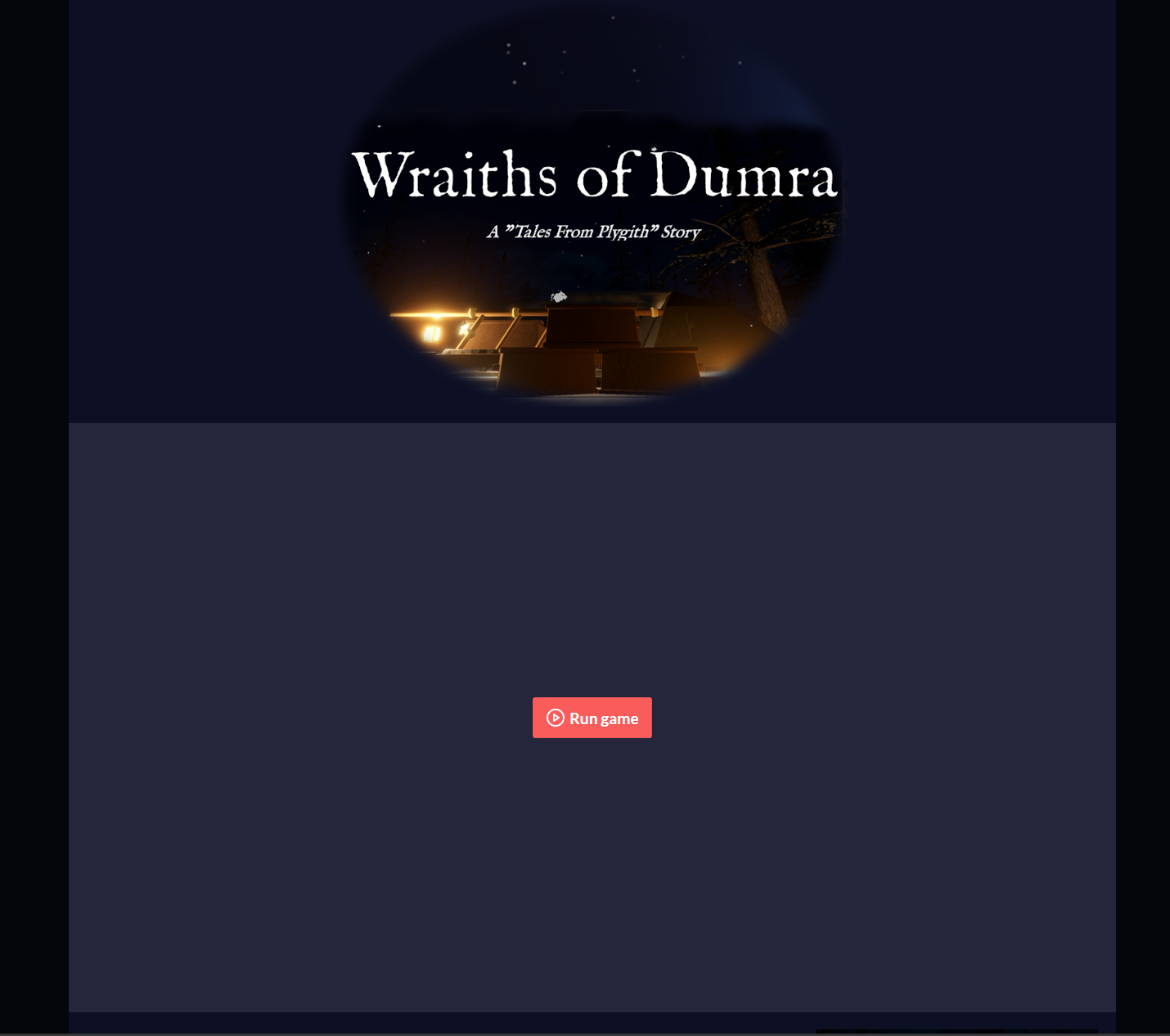
Howdy! My name is Jake and I was lead programmer, project manager, and lore master, I guess, on the Wraiths of Dumra. I have quite a bit of dev experience, though not in game dev and this was my first real end-to-end game I've completed. I couldn't have picked a better team to do it with either!

I'd like to start with some general information about the game then move into what went right and what went wrong.

For more detailed breakdown of the whole process (at least from my perspective) feel free to browse through the dev logs I've been writing throughout the process.

The Team

The team consists of three of us: Andrew, Terra, and me. We've all known each other for a long time but have never really worked on a project like this together. We were sharing what we were individually working on with each other and the idea of doing a game jam came up. None of us had ever done one before but hey, isn't that the point of game jams? Dip your toes into chaos to see if you like it?

We found the Themed Horror Game Jam #22 and thought it sounded interesting. It's spooky season and that was a spooky jam. It was running for 40 days, so we thought that would be great since we all work full-time and we'd have lots of time to casually work on the game. Heh...casually...how optimistic we were!

tl;dr - Key Takeaways

Overall, I'm incredibly proud of our team. I think for our first game jam, and our first "real" game, we did really well. It's definitely rough around the edges and would need more work to make it feel really good but it far surpassed my expectations!

What went right:

  • I love the atmosphere
  • Teamwork really made the dream work
  • Rapid learning of lots of different disciplines

What went wrong:

  • Scope, of course
  • Inexperience with Web Builds, or builds in general
  • Learning to avoid or mitigate merge conflicts
  • Not enough time to polish

I enjoyed my time participating in the game jam, though it did seem to consume almost every non-working hour during those 40 days. That was brutal. I don't think I will participate in another game jam any time soon but glad I did this one. I have a way better idea of what to expect and to look out for moving forward, not just for game jams but also in my own games. I really liked working with Andrew and Terra and can foresee working on games with them in the future, though without the deadline!

Check out the rest of the postmortem below, if you are curious. It goes more in-depth regarding all of this. Regardless, we appreciate you taking the time to check it out!


The Initial Pitch

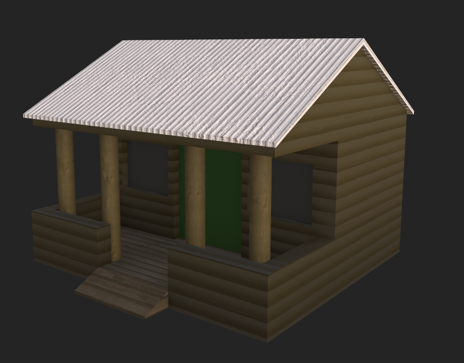
As part of our initial planning, we each brought some ideas to the table, pitched them, and decided on which one to pursue. One of my ideas was chosen as the starting point and this is what it looked like after some refining from the Team. It is based on a myth from Plygith Dune, our worldbuilding project. Most of the terms are more for internal use and reference different places and things within Plygith Dune.

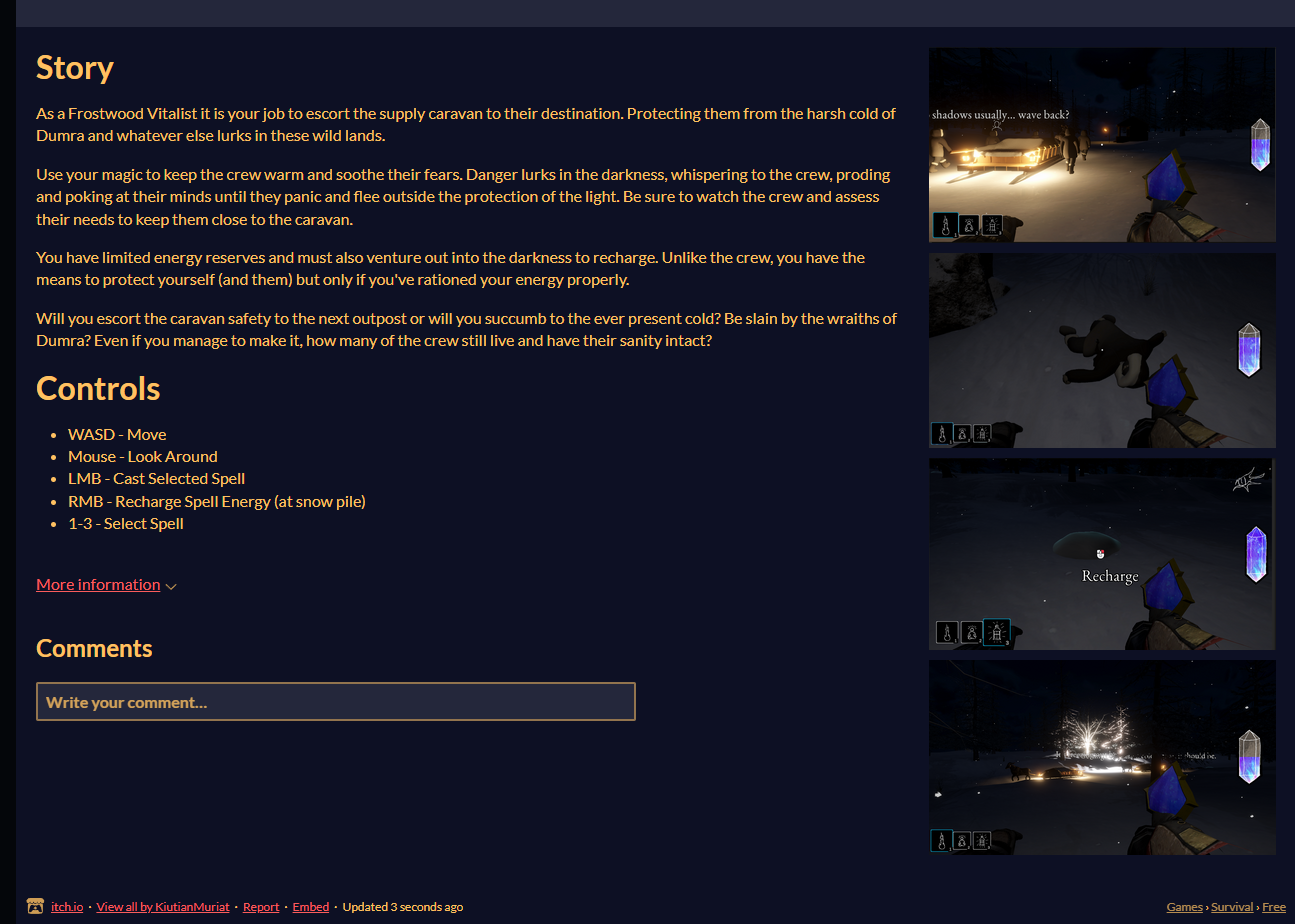
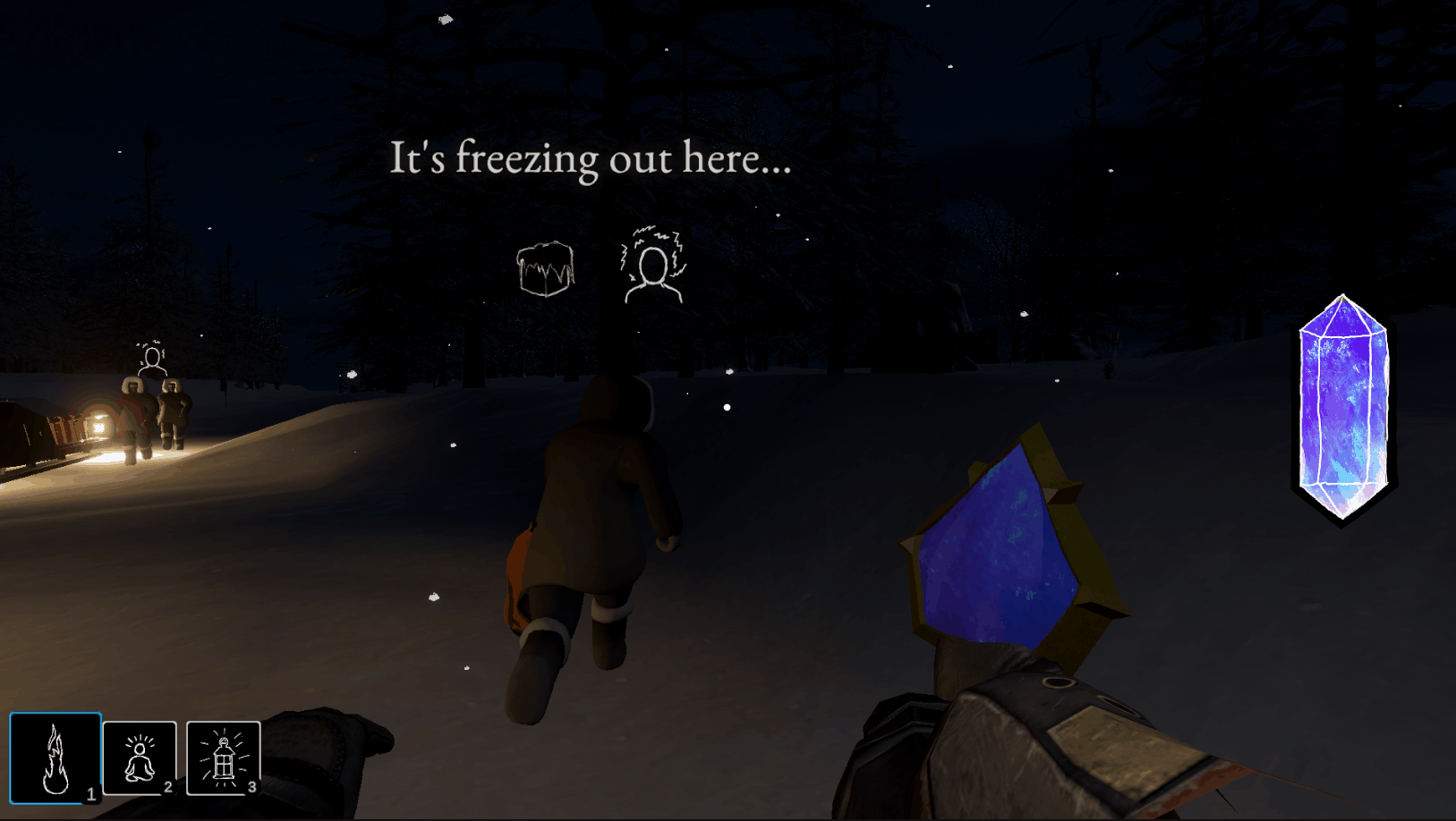
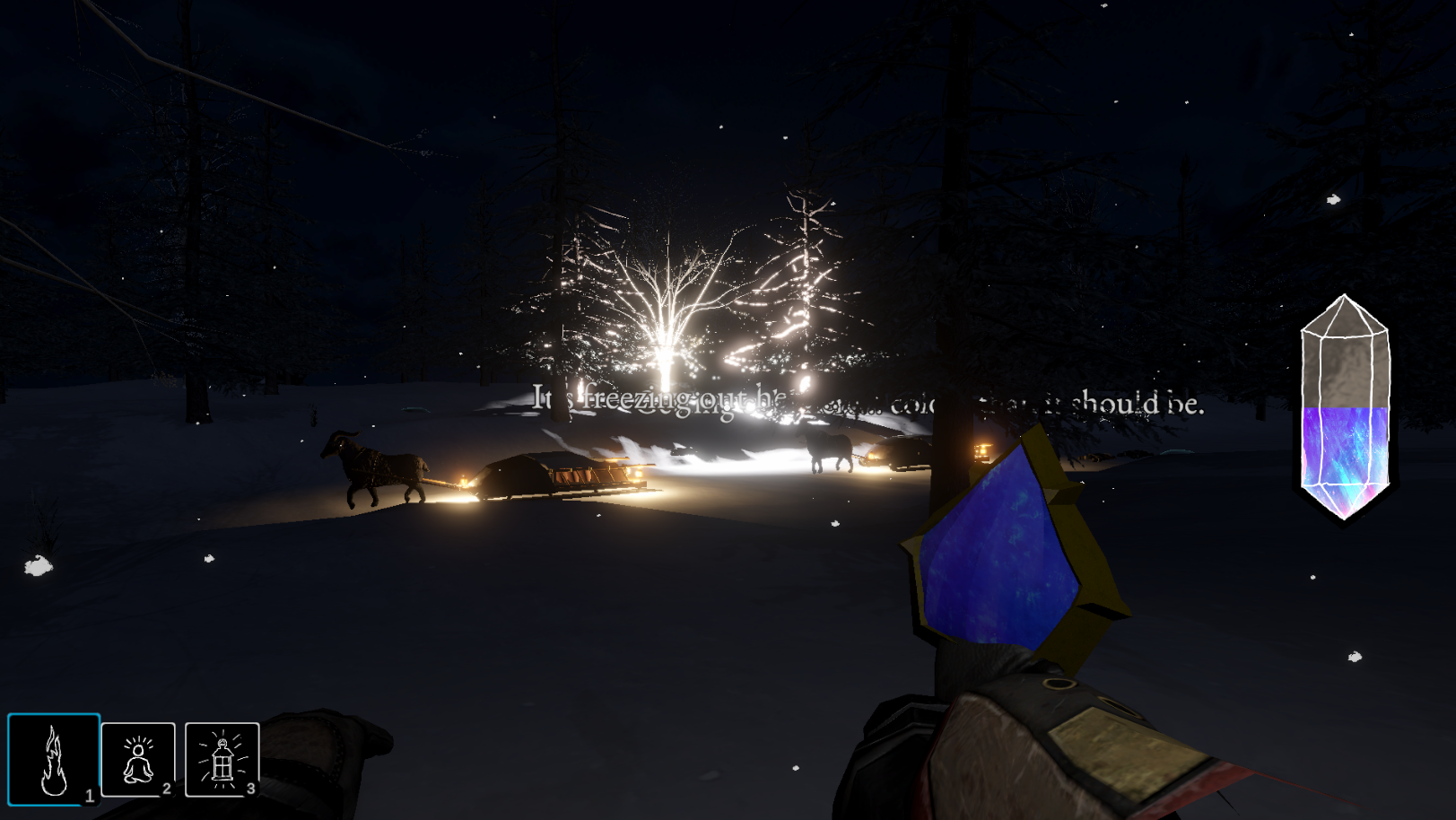
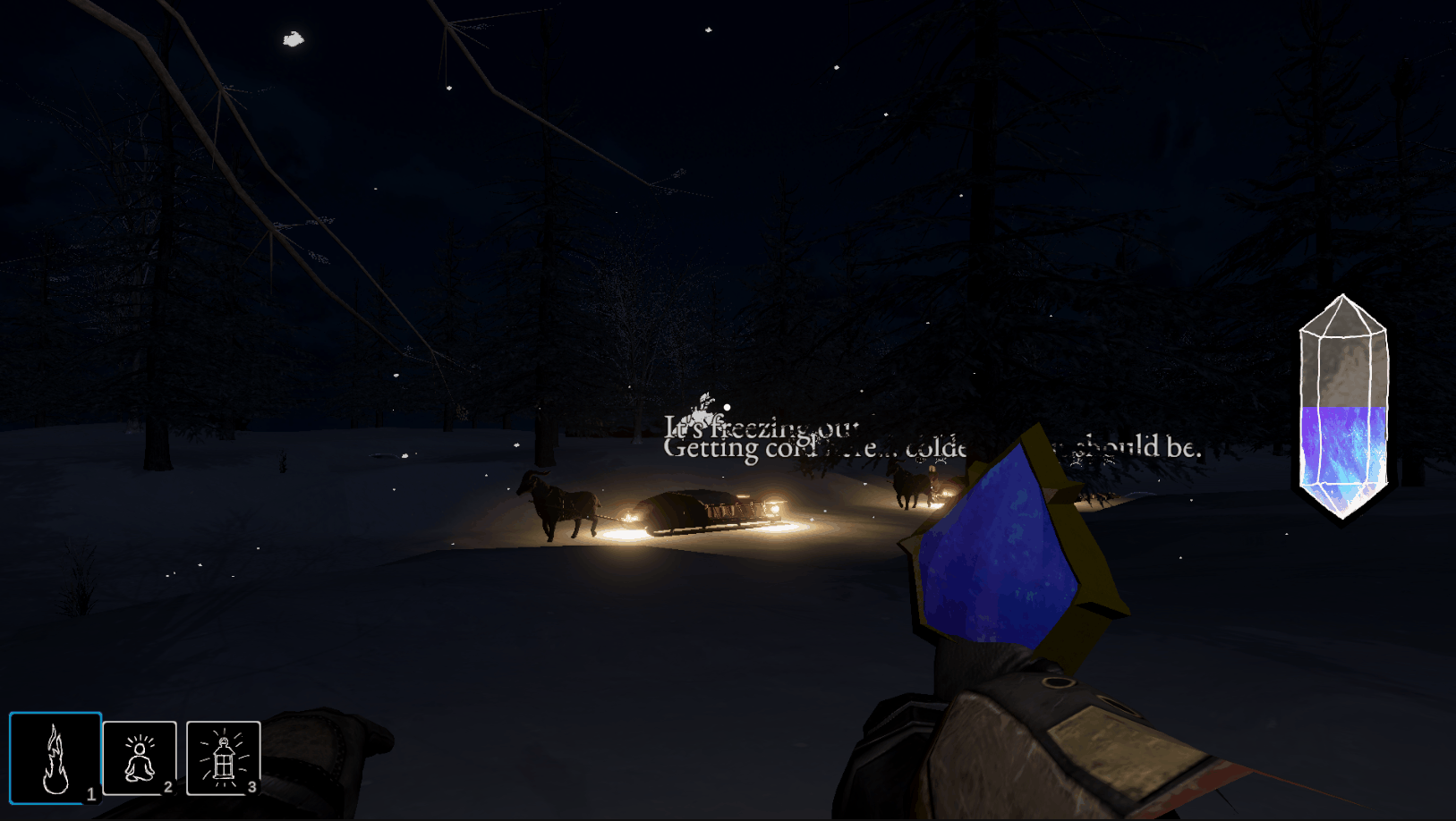
The game is set out in the wilderness of Dumra, a country continually covered in permafrost due to the presence of a large Soulshard. The main gameplay takes place along a well-worn, snow-covered dirt road, just big enough for a sled. The road is surrounded by forest and mountains. Overall, the Player is part of a supply caravan heading between the Frostwood Conclave and the Dumran Soul Shard along the Soulshard Passage. It is a multi-day trek and the caravan is almost at the halfway point, which is Outpost #4.

The Player escorts the caravan through the night to the next Outpost. The caravan moves at a constant rate. The Player can ask the caravan master X times to stop the caravan. The caravan will stay stopped for X seconds before moving on again.

The Player must keep the other characters warm, along with other tasks. When the Player runs out of energy, they can scrounge in certain patches of snow to get a small amount of energy back. Periodically, a patch of snow infused with more soul shard dust can be found, which greatly increases the amount of energy recovered this way.

As the caravan progresses towards the next Outpost, the glimmerstalker events/actions will escalate. Sometimes, (possibly due to hypothermia) the caravan members will wander. The Player will have to go retrieve them, leaving the light of the caravan. The Player has a faint light that they emit and can cast a spell to increase the brightness and radius of that light. If they don’t find the character in time, the character will be killed with a screech and a flash of light.

Once the caravan is within a certain distance of the Outpost, the sky will start to brighten the closer they get.

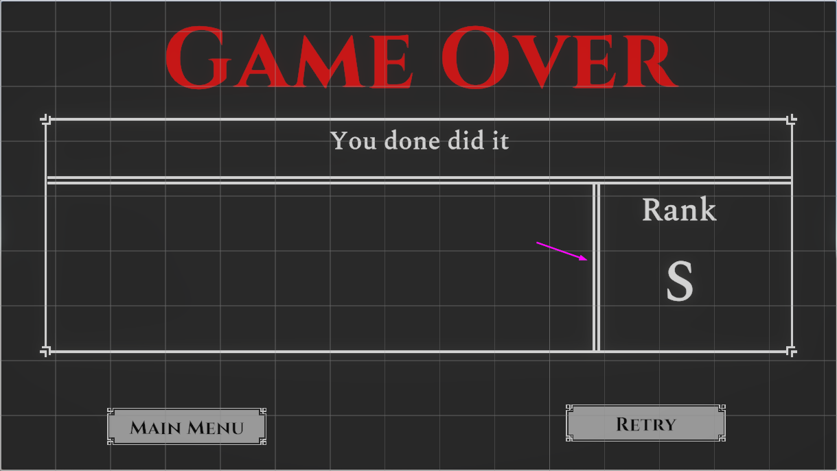
Once the caravan reaches the Outpost, the game ends and the Player is scored on their performance.

I was extremely excited about the game idea. While I wasn't sure how much fun or horror-y it would actually turn out to be, it was the first real project being made set in the world that Andrew and I have been building off and on for over a decade that had the intent of being available to the general public. That was something that we've wanted to do for a long time but it just kept getting pushed off. It also gave me an excuse to build out Dumra more and explore more details about it.

Here is where the game takes place in the wider world of Plygith Dune.

A map of Dumra showing the route the caravan is traveling on

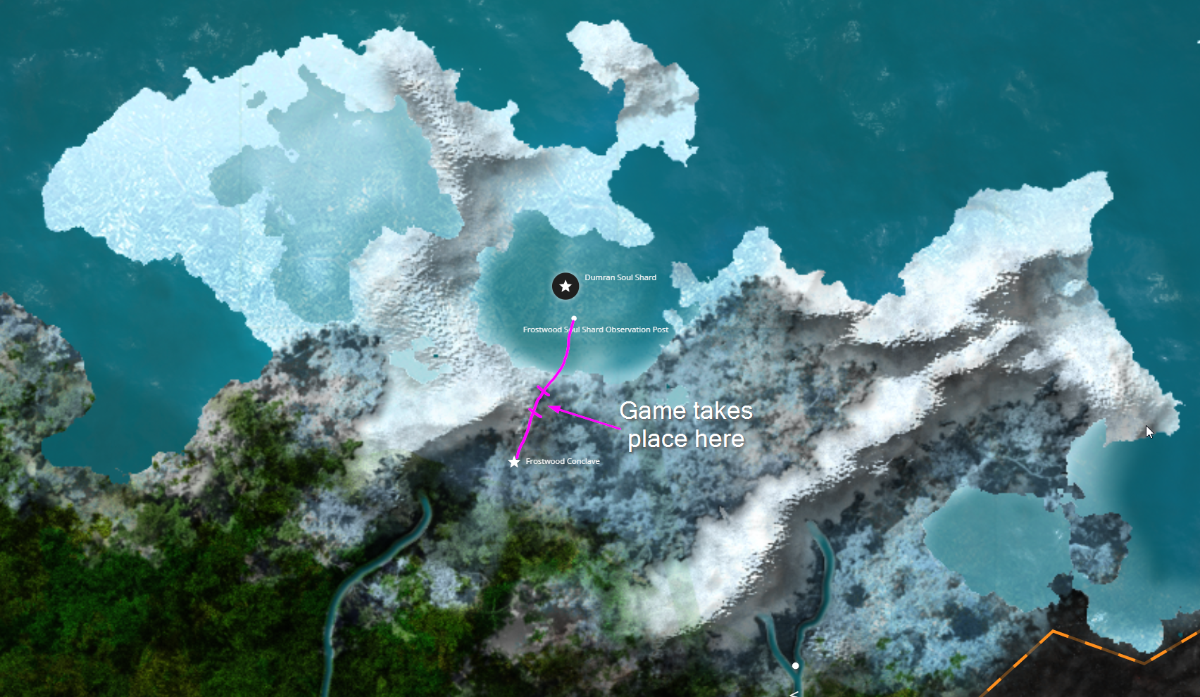
The map was also created by Andrew!

We created a project in Azure DevOps to hold the code repository, a wiki, and the board items/tasks that we needed. After getting the pitch down, we took some time to lay out what tasks we thought we would need and made a first pass at prioritizing them. Along with this we assigned "soft" roles to each team member, based on what things we were interested in.

  • Andrew wanted to do some coding, audio, UI, modelling...really a little bit of everything
  • Terra wanted to do some coding, modelling, and effects/atmosphere
  • I wanted to mainly do the coding while jumping in where needed

With the tasks and general roles defined, we got to it!

What went right

Atmosphere

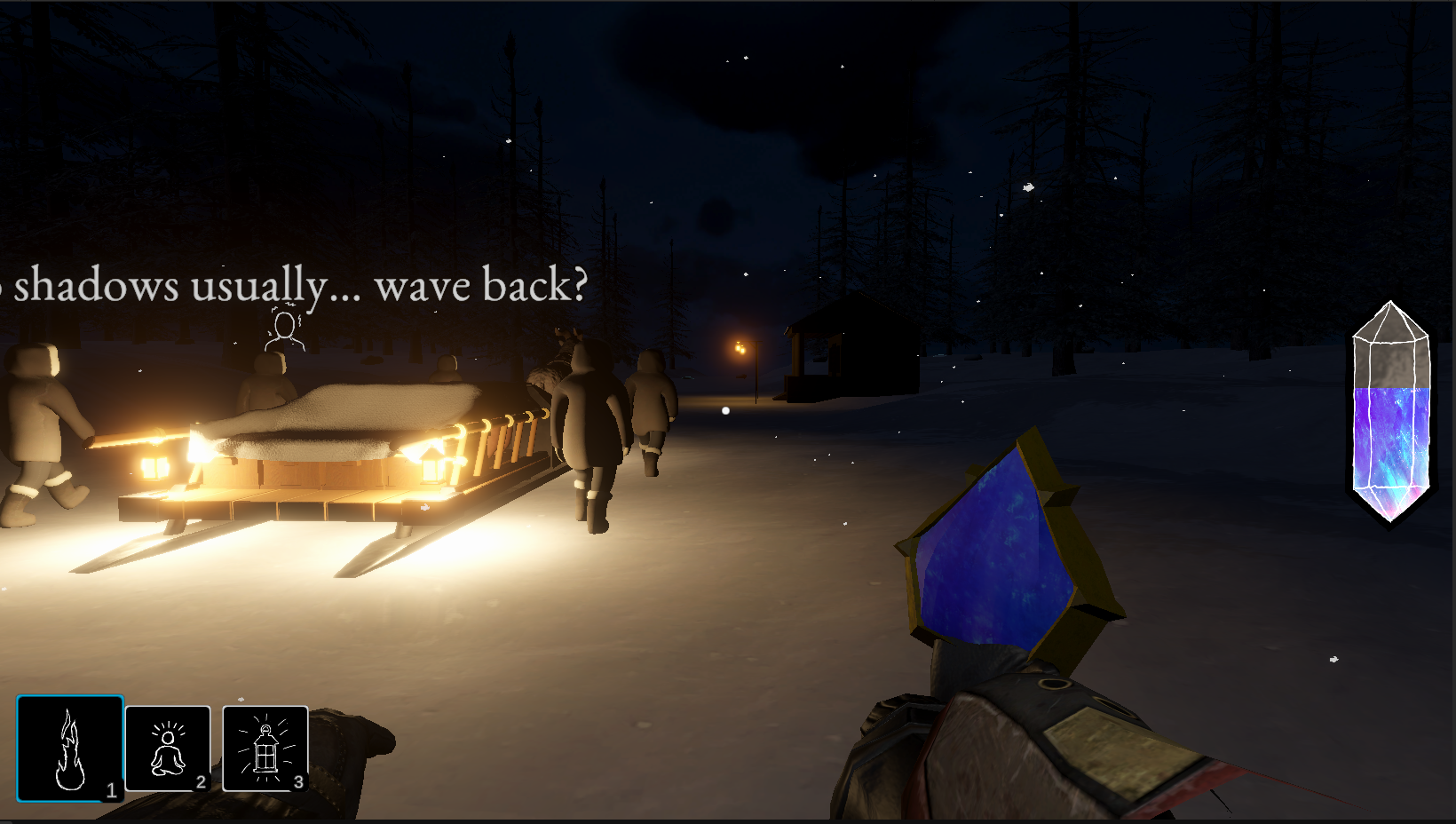
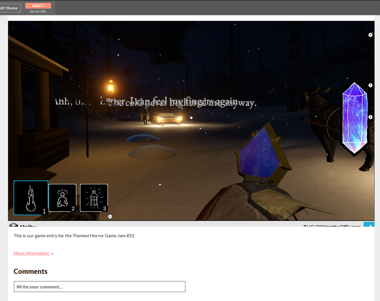
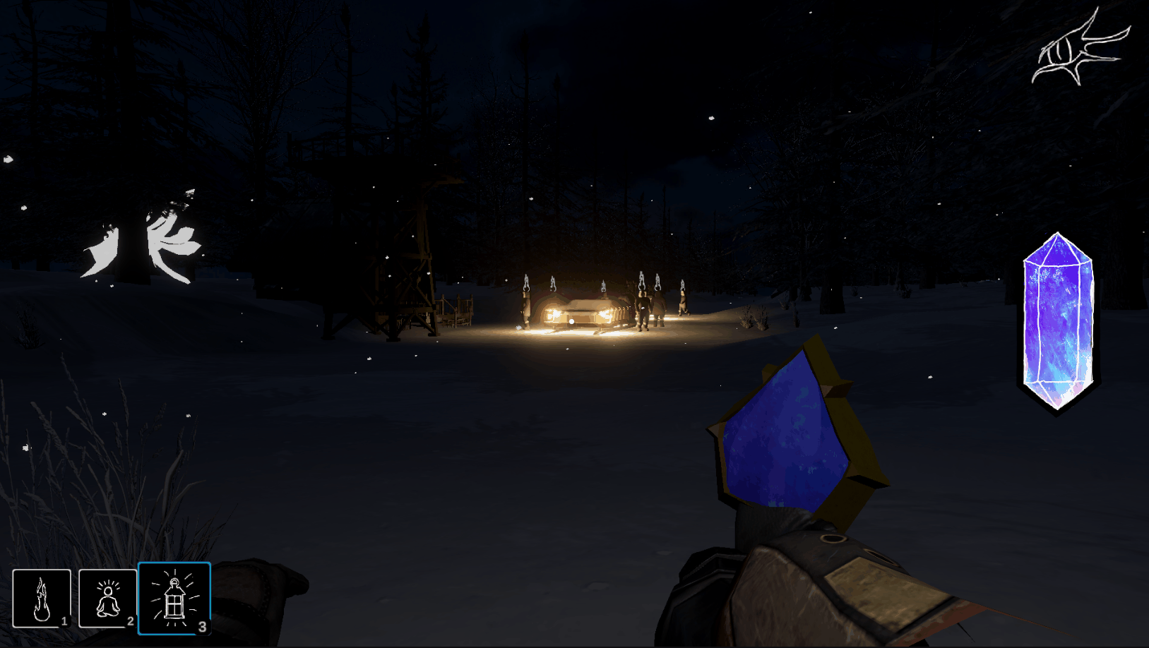
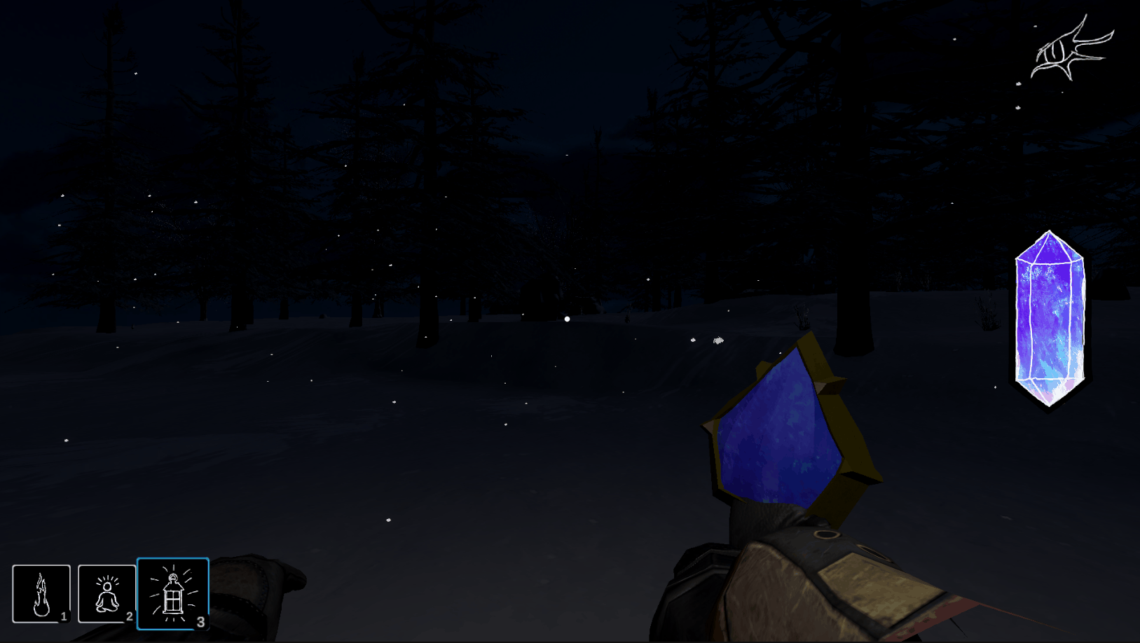
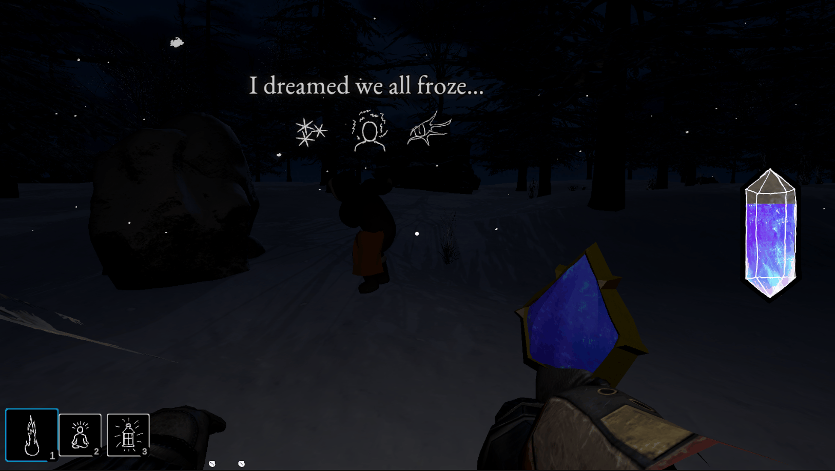
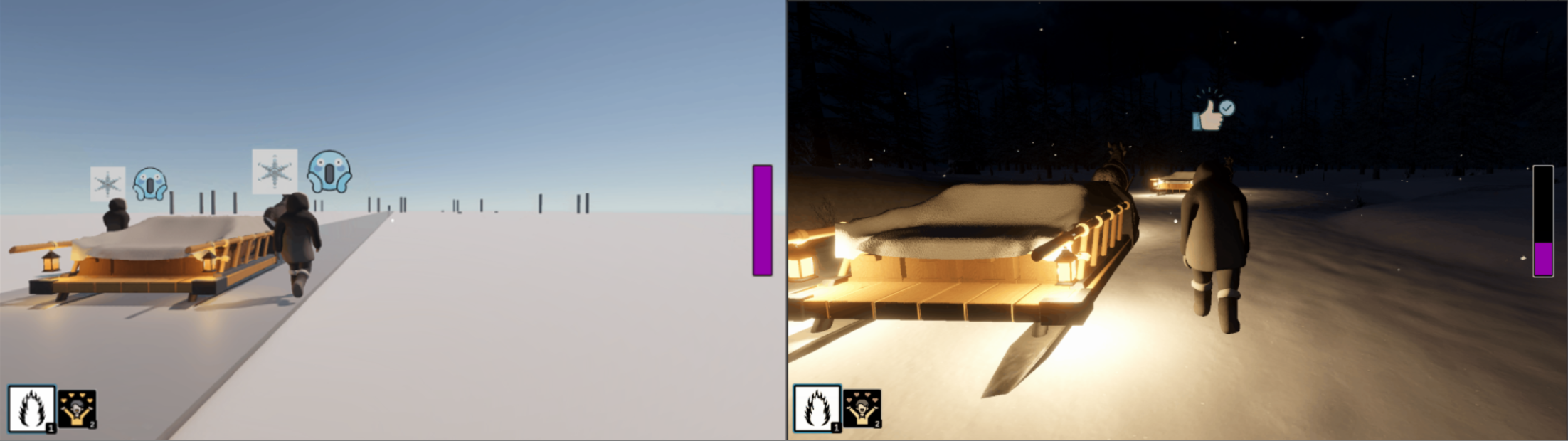
I think one of the things that went the most right was the atmosphere of the game. We wanted it to be a dark night in the wilderness and I think we captured it really well!

Screenshot of the starting outpost to show off the night atmosphere

Terra had a major part in defining the visual atmosphere of the game and Andrew contributed greatly to the UI and audio atmosphere. I mainly just help nudge things along where I thought they needed to. I guess I did model/texture most of the key art, so there is that!

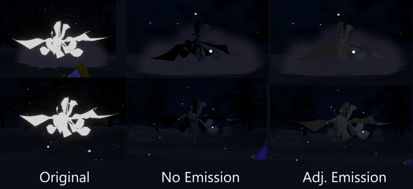
Terra worked really hard to bring the night feel to the game and to make the snow piles stand out in the darkness. I think she did a great job on it! It was amazing playing the game for the first time after her changes and seeing the massive difference it made. Here is a before and after of the changes. Incredible! And it got even better once she redid the terrain and populated the trees and such.

Comparison of the game before and after Terra added the atmosphere

On the audio-side, Andrew is not an experienced composer but he really brought it with the sound. He made several music tracks, as well as almost all of the sound effects (I snuck a few in...). While we didn't end up using all of them, the ones we did use really add to the atmosphere. The main song that plays when someone is being stalked is amazing. That deep cello really fits the mood that Terra set up. By far my favorite track.

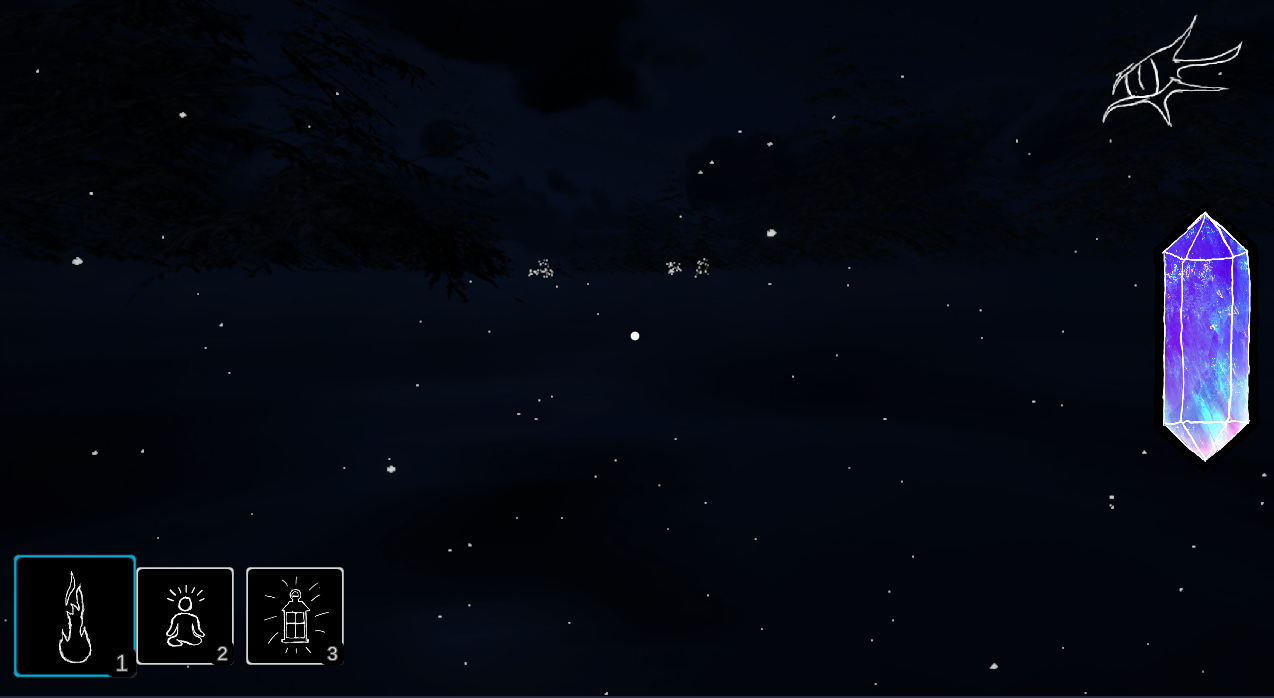
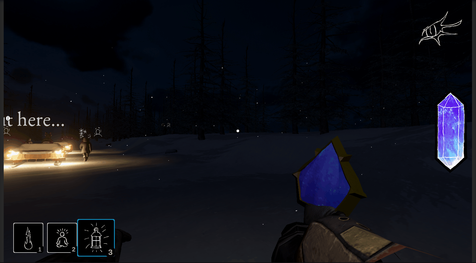
Another aspect that Andrew knocked out of the park was the icons. We went through quite a few iterations on the icons and most of them didn't feel right. He was working on redoing the spell energy display (the crystal on the right side of the screen) and he did these sketchy lines and I was hooked. The sketchiness of it, the imperfect lines, it all felt like it matched the overall aesthetic and vibe of the game. He then presented the Warmth spell icon (bottom left corner, 1st box) with the dark background and the white line work and that became the standard for the other icons. Once we had a direction, Andrew was able to quickly do up the other icons. They look consistent and they look great!

Screenshot showing the icons Andrew made, in-game

Teamwork Makes the Dream Work

For never having worked together directly on anything like this before, we ended up working really well together (at least, I think so). As mentioned earlier, we kind of fell into different roles so most of the time we weren't stepping on each others toes.

We had some growing pains, as expected. While Terra and I had some experience with Unity, we'd never worked on a Unity project together, let alone with version control. Luckily, we are both familiar with git from our day jobs, so we weren't going in completely blind. In fact, it was way less complex (git-wise, at least) than my day job where I am dealing with a old, gnarly mature codebase with lots of binaries that don't play well with version control.

Andrew did not have any experience with either git nor Unity, nor professional software development, nor some of the other programs he ended up using...but he is a sharp cookie and picked it all up pretty well! I had to ride the (very fine) line between trying to teach him good coding practices and crushing his soul with feedback. Sometimes, I felt that I was going too far but he kept asking for more. So many tutorials teach you bad practices in the name of simplicity and I wanted to make sure that Andrew avoided a lot of the pitfalls I've seen junior devs make. He made great strides in using all of those programs and I'm really proud of him. I learned that I may also have some control issues regarding code consistency and such...I think it bleeds over from my day job where I work in a very messy legacy codebase and just have to deal with jank!

Learning New Things

Andrew wasn't the only one learning new things during this game jam. We all were. And while I am putting this in the "What Went Right" section, it is not without its costs. We attempted many things that we had not done before. Some were exhilarating while some were just straight up frustrating.

I feel like we all have a way better idea of what goes into making a "complete" game now and the different workflows involved along the way. We got to work with new tools, learn new skills, and learn the process of publishing a game on Itch. Overall, I think the net positive means it deserves its spot in the "What Went Right" section.

However, the dark side of a lot of learning is that there is so much to learn for each given task. Normally, this isn't as much of an issue, because you can just take the time you need to learn it to the level you want. Don't know what the topology of a goat should be? Find some tutorials and play around with retopologizing until you get something that looks right and animates properly!

Well, that is all fine and dandy until you slap a deadline on it. Now you feel pressure to get the thing done and it is incredibly frustrating to not be able to take the time you need. Oh, that's a 2 hour long tutorial? I guess I'll skim through it because I can only spend like 5 minutes on it. Hope I'm not missing something important! Spoiler, you are. While we all felt that pressure, I think Terra felt this the most. She really likes digging into different topics to get a better understanding of them. She is very passionate about learning and that passion was just constantly being suppressed in the name of progress.

What Went Wrong

The Cliché...Scope

Would this even be a game jam postmortem if we didn't bring up that the scope was too large

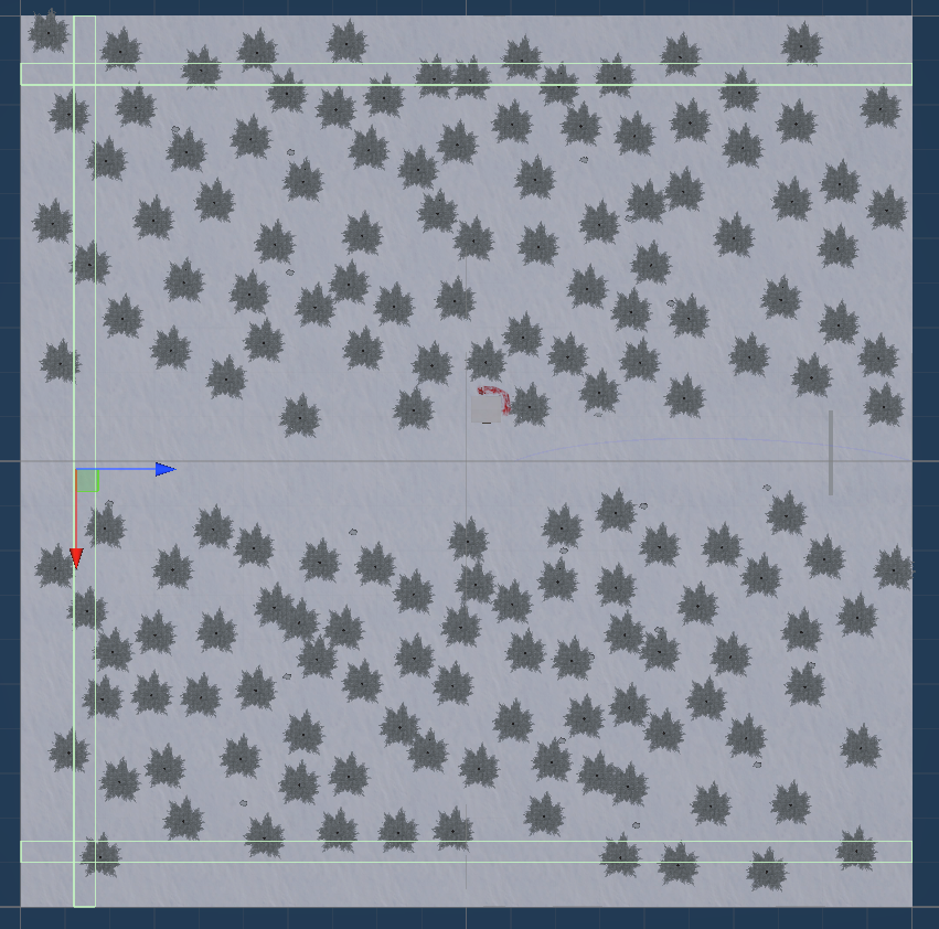
We tried to be very conscientious of scope when we were planning out the game. We initially got all of our ideas out into the DevOps board and spent quite a bit of time designating which ones we thought were the core game and which ones we thought would be stretch goals.

Looking back, I think we actually did a really good job on defining what the core game would need to be and to get through all of it, while managing scope creep. Terra did a really good job of reigning in scope creep whenever she saw it. Advocating for simple, practical solutions to problems, even if there were some corners cut. This is a game jam after all and not a product that needs to be maintained long term that people are paying for. Here is where we ended up at the end of the submission period, as far as our board items went.

Category Board Item Count
Total (Completed or not) 195
Completed 119
Core - Not Finished 12
Stretch Goals - Not Finished 64

That means we got 91% of the core board items done before time ran out. The majority of those are small things that if we had like 3 more days we could knock out. Amazing! Well, it is amazing until you realize that this game jam became an all consuming void that stole almost all of the time we weren't working our full time jobs. The occasional day off here and there but right back at it as soon as possible.

That is where I think the scope was too big and why it is in this section. Going into this, I think we thought that we would be able to work on it a couple of days a week and still get through the scope. This was a fantasy, plain and simple. When I put on my project estimating cap, I was thinking in terms like I would at work...you know, where you are working on this for 8 hours a day with a team of people who know what they're doing, not three amateur game devs trying to build it in their off-time. It should have been half the size that it was, though it sounded small when we were talking about it!

Several other choices made the tasks even harder, which contributed to the amount of time each task took. We wanted to do a first-person 3D game. None of us are 2D artists and I really wanted to work in 3D to gain more experience for the types of games I want to make. However, 3D is a lot more involved up front than 2D. You've got to model things, then unwrap them, then texture then, then animate them. A lot of work with workflows that we are not familiar with!

We also wanted first-person because, being a horror game, we wanted the player to feel more immersed and in danger when they are playing. This brings its own challenges though. Every model/texture/particle system needs to have higher fidelity (assuming you want to avoid the low poly/Synty-style aesthetic). This meant spending more time to make things look good where you wouldn't have had to spend that time if it were a top down game where the models are farther away from the camera.

The Grind™ definitely lead to feelings of burnout throughout the project. The light at the end of the tunnel was the only thing keeping me going towards the end. One last push! It was brutal though, and not something that I'd like to repeat any time soon. In some ways, doing a week game jam would have been preferrable. Even if it was way more chaos/stress, at least you only have to sustain it for a week. 40 days, plus the pre-planning, is a long time to be hyper-focused on one project.

I think focusing on the "finding the fun" first would have helped with this because we could have pushed it out the door if needed. We did try to structure everything to where we were building the most important stuff first, in a way that we could push it out but we didn't account for the follow up work once you got a new big feature in. Take the glimmerstalker for instance, the main antagonist of the game, I got the system in to control it and have it affect the crew but there was so much follow up work that was needed to make it actually decent to play with. Sure, the code was there but what about the sounds, the visuals? These things took a lot longer than expected and made it so we couldn't really push out the game because the overall feature was half finished.

Web Build Woes

Going into the game jam, I think we all had envisioned "making a game and submitting it on Itch". None of us actually knew what that would entail. I've never really used Itch for games before, just for purchasing some assets, so I had assumed that it would be like Steam. Obviously, that isn't how it works. We had originally intended to do an .exe that people could download and play. After seeing some of the other submissions, we felt that a web build would be better instead. We thought that it would make it more likely for people to play it, and therefore rate it. It was more of a hassle to download a game to play it, we saw that in our own behavior towards the other game submissions.

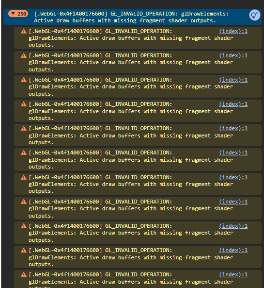
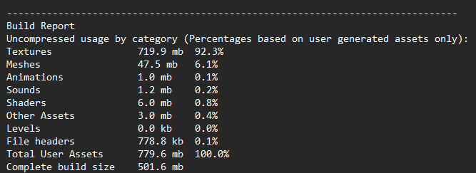
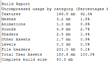
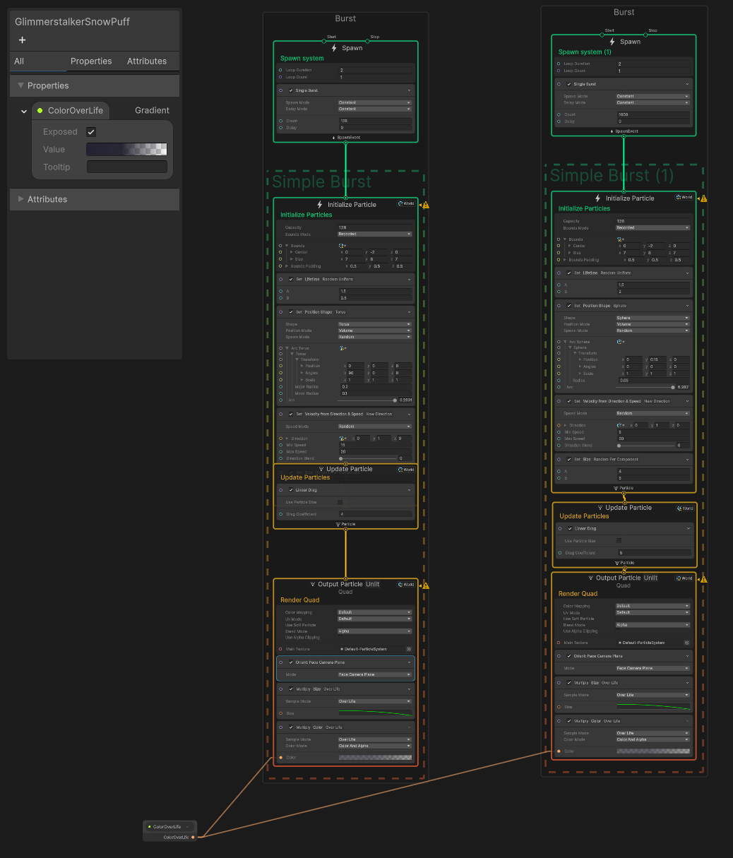
The problem is, WebGL (that the Unity web builds use) has some restrictions on top of just differences in expectations of web games. I had to completely redo the particle systems because the Unity VFX Graph runs on the GPU and WebGL doesn't support that. We also ran into major problems with build sizes (though we should have been more conscientious of that anyway) due to the (sensible) limitations that Itch puts on web builds. Crazy how much space textures can take up. If we had been targeting web builds the whole time, we would have been able to catch these things way earlier and hopefully could have avoided redoing a bunch of work. Live and learn!

Speaking of living and learning. Another practice that we should have implemented earlier was to make a web build on our branches before completing the Pull Requests and verified that everything is still working as expected. There were some big discrepancies between running it in the editor vs doing a web build and running it. Like the aforementioned particle systems, or the major hiccup we had on release day where the web build was completely broken but it worked flawlessly running in Unity. We would have been able to avoid the release day fiasco altogether and so much work would not have had to have been done twice.

Merge Conflicts

As none of us have ever worked on the same game before, there were growing pains when it came to merging in changes from the other team members. We generally tried to avoid working in the same areas at the same time, which helped a lot, but the one area we kept running into conflicts was the Main Game scene. Most of the features touch that scene in some way and we were constantly having to manage merge conflicts on it. While the scene files are stored as text (which helped) it was very easy to accidentally mess up the merge and have things go missing. And you may not even know they are missing until later. Merging code conflicts was easy and straight-forward but the scene and asset files were troublesome.

I looked around online for tips to avoid merge conflicts and a couple people mentioned creating more prefabs. The idea being that when you make changes to it, those changes are stored in the prefab files instead of the main scene file. As long as you aren't working in the same prefab, life is good because the reference in the scene doesn't change, so no conflict there. I'd like to give that a shot next time.

The two biggest causes of conflicts were the menus/UI and the characters (crew, glimmerstalker, player, etc). We didn't have any of the menus prefabed so anytime we made changes on them there was a high probability that something would go wrong. If we had been using prefabs, there would have been fewer changes being made in the actual Main Game scene and a lot less to fix. For the characters though, they were all prefabs already but because they had so much functionality in them, there wasn't much we could do. I do think we could have been better about "applying" the changes to the character prefabs though, so the changes actually lived in the prefab file, instead of the Main Game scene.

We're still figuring that workflow out.

Polishing Some Areas

While I think the game overall looks really good (way better than I could have hoped for) there are definitely areas that could be polished. The main areas that I see could be improved are: tuning, audio levels, UI, settings.

  • Tuning
    • I think we could have spent more time (if we had it!) tuning the game. Things like the spell costs, the scoring at the end, energy rates, snow pile spawn positions, number of tiles, etc could all be tweaked to give a tighter game feel. One good example is the crew dialog. They are quite chatty and the text sometimes overruns each other on screen. There probably could have been more we could have done to make that nicer to read
  • Audio Levels
    • I think Andrew did a great job on doing the audio. However, one thing I noticed is that there is some inconsistencies in the volume levels between different tracks and different sound effects. You might go from a quiet song, so you turn up your volume and then the Attack song plays and it is very loud, comparatively.
      • I am also guilty of this on some of the sound effects I added in. The bird flutter/flee sound effect especially. It is way quieter than the others, though I had tried to fix it
    • It also seems like the audio overall is a lot quieter compared to other games/applications. I had to turn up my volume quite a bit but then a notification would come in and be very loud.
    • I am not really sure what the process is to normalize all of the volumes of everything is. I am not very skilled at audio stuff and didn't have time to research it during the jam.
      • I also found out that I don't particularly care for doing audio work, for whatever reason, so I'm happy to leave that to Andrew!
  • The UI
    • Again, overall I really like the UI and think we did a good job. There are just inconsistencies within it that I think could have been avoided if we had done some design work as a team before creating everything
    • For instance, the Main Menu is light text on dark background elements but the pause menu is dark text on a light background. These probably should have been the same pattern across all of the elements.
    • The tutorial screens also suffered from this, though they were made up as the team directed. The actual screens look really awesome in isolation but they don't quite fit the vibe of the rest of the game. I think the icy background fits but the buttons are my main points of contention. Looking back, we should have used the existing buttons from the other menus instead of the arrows. The arrows were a suggestion I had but I think it was the wrong call.
    • We did try to combat this part way through by setting up a Figma project to figure out how to make them more cohesive but we didn't have the time to actually rework anything
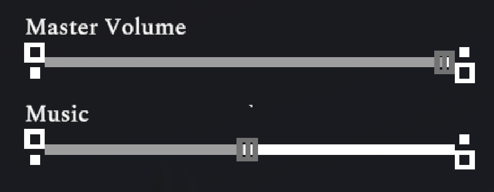
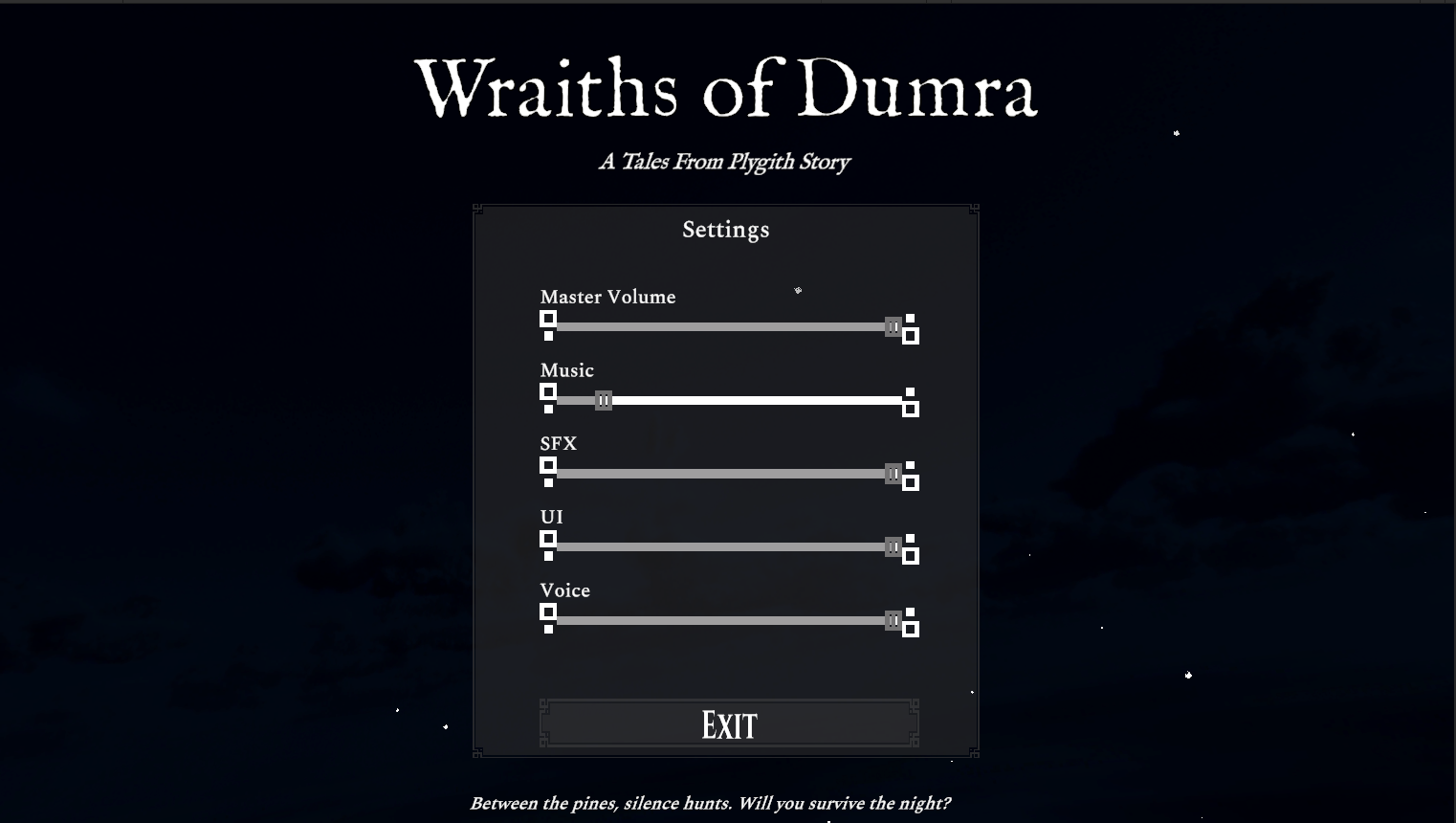
  • Settings, or lack there of
    • I think more settings needed to be added. At the bare minimum, a brightness setting should have been added. The game is dark, and is meant to be dark, but darkness is hard to account for on different screens and different eyes. I think it would have made the game more accessible to a wider range of players.
      • If you brighten it too much you lose the sense of being out in the middle of nowhere with your dark vision blown out by the lantern light. But too dark and people can't play it. A very delicate balance that is highly player dependent

The Wraiths of Dumra — A Reflection

by Andrew T.


Intro

Hi there. I'm Andrew. I haven't introduced myself before, and Jake has been awesome enough to set up this blog to allow us to post updates. Towards the end of the Jam, I've had a lot of self-reflection about Wraiths, and game development in general.

A bit about myself beforehand: I've made a couple minor games in the past (they do not really count as full games—no lead or project management, though one was published to the iOS store). I've also dabbled in c# here and there over the years but mostly work in VBA at my "day job." So, to start using Unity and working on complex c# systems was a learning experience to say the least.


It Has Begun

We started off in the concept phase mostly knowing what we wanted to do, and all of us were excited about having the setting be in a fantasy world we've been working on for decades.

We paid careful attention to scope creep, knowing that 40 days would fly by faster than we expected. We wanted to have a tutorial intro, random events, and multiple different tiles. Early on, we realized that it was still outside our scope.

Even as we tried to slim it down, as the weeks went by, we realized we still dreamed too big. We had to knock a few things off the board to allow us time to finish the game from A to Z. In hindsight, trimming earlier and harder might have given us more breathing room.


Team of Three

Collaborating with each other has been our dream for years. We each have our own disciplines, strengths, and weaknesses.

I feel like we naturally fell into a rhythm that worked really well for us. Terra knocked it out of the park with the scene design and the Gaquk (the goat). Jake has been wonderful as a project manager, senior dev, and approval man.

He was very patient with me while I worked through a lot of coding conventions (I still have a lot to learn!). At one time, with 20+ comments on a PR, I said "release me."

Overall, I’m pleased with the way we were able to complete our goal.


Scope Versus Reality

There were so many times I really, really wanted to “finish” a few textures and songs. I kept thinking “It’s not good enough!”

That, in turn, was the hardest part of it all—deciding what good enough meant for a game jam, and when to call it done.

Towards the end, as our board dwindled down, I noticed I wanted to just get it over with. It came to that point where I said, “I'm good. This element is good enough.”

Forty days was a great timeline to work on everything (even while juggling my full-time job), but it definitely had an all-consuming effect. A lot of things in real life were put on hold because of this. At that point, we’d already cut a lot of items, and the dreaded deadline was fast approaching.

For instance, we had some issues with our latest build on submission day, and the blood decals had to get removed. I had to accept that certain things take priority when you’re racing the clock to finish.


The Software Gauntlet

Most of my day-to-day work lives in VBA, inside Excel spreadsheets. Stepping into a full IDE and starting fresh was disorienting at first. It felt like I've been working in a cubicle and suddenly got thrusted into a spaceship.

Let alone coming from Unreal, Unity’s workflow felt like learning to speak the same language with an entirely new accent.

During this jam, I juggled a lot of different programs. I know Photoshop decently enough to do what I want, but I was also able to play with 3D Coat and Substance Painter. That came with it's own challenges with an entirely new set of hotkeys to learn. I had to stop myself from watching 4 hour long youtube videos so I could finish my board item.

Learning the hotkeys between just those three was challenging enough; adding Blender, 3ds Max, Cakewalk Sonar, and Git on top made for some serious mental gymnastics.

I ended up creating a document to house useful hotkeys, shortcuts, and coding conventions. That helped a lot. I still had plenty of muscle-memory keystrokes that almost sent me into a stroke.

There were moments I enabled some mysterious feature and had no idea how to turn it off.

Despite the chaos, it reminded me how powerful it is to know a bit of everything, and how humbling it is to realize how much there always is to learn.


Learning Curves

This project really made a jack of all trades out of me. From sound design to modeling, animating, UX/UI design, and everything else, it was a challenge trying to do them all.

It was fun and interesting, but I can see why solo devs take a long, long while to create anything meaningful. I think the thing I struggled with most were Unity-specific issues like, “Where is this located?” or “Why is it doing this?”

Learning best practices with Unity was tough at first too, but toward the end, I really got the hang of it.


Ink-ing Around

Ink. Inky. Inkle.

I’d heard about it a few times, seeing it in games like Dear Esther. I always liked the storytelling aspect and how "easy" it seemed to be able to incorporate stories with branches.

While this project was small, I thought Ink would be a perfect fit for some of the dialogue. In fact, it turned out so well I used it for all the different endings, stats, and NPC dialogue.

This was a bit of a learning curve too, because I was just getting started with c#, and switching over to Ink was extremely different.

I really love narrative games, and as mentioned, the game I'm working on happens to be like that too. I appreciate this jam as it gave me an excuse to put Ink to use and see how it blends into game engines and the game itself.


The “It Clicked” Moment

The first couple of weeks for us went well. We were excited, churning out code and items fantastically. A lot of grayboxing was involved.

For myself, I had my own scene where I put galaxy-textured cubes in which acted as snow piles. From simple planes and boxes, Terra arrived with the terrain. And wow. With that, she did the lighting, snow, and overall feel of the game.

For me, that moment loading into the stage and just being there while the snow came down around the player really made me say, “Yep, this is our game.” I was so proud of all of us, and we still had a long way to go.

The next moment was the audio. I created all the songs and sound effects (minus an edit of the healing spell) and was able to throw them all together. I can't take credit for the Glimmerstalker audio, Jake did that!

Getting those in there really made the game feel alive.

I believe the overall consensus is that the Stalking Theme is our favorite.


Emotional Lows

Coming from a very inexperienced dev background and working with two people who have years of experience humbled me a bit. I’m not used to being in that position and haven’t been in many years.

While I took everything in stride, there were times where I just couldn’t get it, or I felt extremely incompetent. It made me frustrated that a lot of the work I did had to be redone. Not because it was bad, but because how we implemented it changed.

So, it wasn’t like I was doing anything wrong, but it still felt bad. Jake and Terra were great and able to reassure me I was doing well.

Then came submission day.

We had everything hooked up, wired, dialed, and tuned. As we were getting the latest build up to the web, it turned out it was broken!

Jake spent a good amount of time trying to figure it out, and I couldn’t either. With about eight hours left before submissions were due, we decided to call it and pull the last best branch we had that we knew worked.

So, in crunch time, I had to redo everything I’d done in the past week—as did Jake. That definitely put a damper on the spirits.

And as of right now, our web build still isn’t complete how we had it before. I am currently working on it, but as I’ve often said…

Good enough.

In the end, I realized that being part of a dedicated team means trusting the process, and that even setbacks can lead to better versions of your work.


Reflection and the Next Horizon

While we had to restart a bit, it still felt surreal to see it working and public. It felt raw, and I felt a great sense of pride in it.

I looked at it and said, “I built that.” Not the whole thing, but collectively, and that was emotional for me. It’s been a long 40 days, let alone having work and life in the middle of it all too.

Having finished everything felt really nice.

I still want to make games. I still want to explore multiple pipelines and tools, to continue my learning. Naturally, I do feel some burnout. I’d like to be able to relax, recover, and take a breather before continuing my own journey.

I am pleased with the team we had and would love to participate in another Game Jam…though perhaps next year.

A lot of this has been a learning experience, and now that I have one game under my belt—officially—it won’t take me as long to understand the core concepts behind all these different toolkits.

And hey, I have my shortcut sheet now too!

So, after all that, in short: I enjoyed myself. I love my friends. Nothing catastrophic happened (until the end), and we still came out on top. We finished a game from start to finish, and I couldn’t be prouder. Plygith Dune has been a dream of ours. A world we’ve been shaping on and off for years and we finally brought a piece of it to life.

That accomplishment alone feels rewarding enough.

Game development is hard, messy, and deeply rewarding, but seeing something you’ve only ever imagined come to life makes it all worth it.

Every snowflake we placed, every sound we mixed, every bug we chased. It all added up to something real. And that, for a first full game, feels like magic.

Getting a Tutorial In

One of the last things we wanted to do was to get some type of tutorial in. Originally, we had wanted a full, in-game tutorial that had narrative and would teach the Player how to play more organically. That did not happen! It would have taken way too much time to come up with dialog, script other animations for the Crew, add a whole character for your mentor, etc. Most of that work would not have translated over into the main part of the game, so very little reward for how much time we had left.

Instead, we opted for a text based tutorial. To make it more digestible, we broke it into two screens: one with a basic intro and the most important details and another screen with gifs showing the character actually performing the actions. We wanted to not just have a wall of text, since that can drive people to not read it.

Andrew did a really good job of creating the tutorial screens and converting the gifs into sprite sheets that Unity could work with! Looking back, I would have liked to have stayed with the same button style that we are using on the other screen, instead of the arrows but it sounded good when we talked about it. This also would have allowed the button to have hover states and such, whereas the arrow is actually part of the background currently. Ah, the joys of deadlines!

Screenshot of the first tutorial page

Screenshot of the second tutorial page

Once Andrew had the screens created, I took on the task of actually wiring them up. He had created them in a separate scene, which had some pros and cons.

Pros:

  • Very easy to work into the overall flow of the game. Instead of Start taking the Player to the Main Game scene, it took them to the tutorial scene
  • I didn't have to worry about setting the time scale or anything to keep the caravan from starting without the Player while they read the tutorial

Cons: - Because it is so isolated, we couldn't add the tutorial screens into the other menus (like the Pause menu). This meant you had to go back to the Main Menu and click Start again to see the tutorial. Not ideal - I caused a "double" loading scene, where you click Start on the Main Menu and it loads the tutorial, then you click Start on the tutorial and it loads the game.

I think if we had integrated the tutorial more as a separate prefab that could be spawned into any scene, that probably would have been better, though it would have been more work to ensure the background stuff wasn't messing up. I think doing it as a separate scene was just fine for what it is and if I had more experience with additive scenes, I probably could have gotten it to work like that anyway.

I wanted a way to not show the tutorial on subsequent playthroughs, since I know how to play the game and I don't want to click through the tutorial every time! I hooked up a "Don't Show Again" toggle onto the last page of the tutorial that stores your choice to the PlayerPrefs. Then, when you click Start on the Main Menu, it checks that value and either sends you to the Tutorial scene or the Main Game scene.

Of course, if you could hide the tutorial, I felt that there should be a way to re-show it. As mentioned earlier, it wasn't as simple as just adding a menu option to show it. Instead, I added a button to the Main Menu that allows you to reset the tutorial, clearing out that PlayerPrefs value.

Gif showing how the tutorial works

Overall, I'm really happy with the flow and look of the tutorial!

Bad News Bears

Everything was looking great and we wanted to get a test build up with the tutorial while Andrew was finishing up some other changes. I got the new build made and deployed on Itch. Everything looked great with the tutorial but when I tried loading into the Main Game scene, disaster struck!

Gif of the error popping up when loading the main game scene

Screenshot of the initial error found in the web build

I had never seen that error before and the previous web build had worked perfectly. What was going on? The error is not very descriptive and online resources didn't really help much. I didn't understand. The game worked great running in Unity, so we didn't know there was a problem. I started tracking down where it broke. I knew the last good web build was the one I did after reworking the particle systems.

Thankfully, we have been using version control, so I was able to checkout the previous commits and make builds off of them to see if they were broken. I was able to go back a commit and the Main Game scene actually loaded but everything was borked in it. Most of the models weren't showing up,, which meant the lights didn't have anything to illuminate, which meant a very dark scene.

Screenshot of the main game with no meshes in it

On that build though, I saw a bunch of errors in the console. Progress! That meant that it was broken on that build and we had more errors to look in to. It was also around this time that I learned that you could Build and Run in Unity to test the actual WebGL build, instead of having to upload it to Itch or similar...simple now that I think about it but it never crossed my mind!

Screenshot of the fragment shader errors

Unfortunately, these errors weren't as helpful as I had hoped. It could be caused by any number of things. We went through and tried a lot of the common causes. None of them seemed to apply to our project. It was all set up "correctly" from what we could tell. Then why didn't it work?!? We did find some Render Layers that had accidentally been removed, which could be the cause but restoring them did not resolve the issue. There were also some changes to the PR_Renderer and Mobile_Renderer asset files in the project settings but Andrew didn't remember explicitly changing them and I couldn't tell what the changes meant. I could tell that a MonoBehaviour was added but it is all in Unity's serialization format and I couldn't see anything definitive on it. Our working theory is that something in the changes made to add the blood decals in doesn't play well with WebGL.

After a couple of hours testing and trying different builds, we were not making any real progress. The end of the night was fast approaching and so was the submission deadline. I made the call to start a new branch off of the last good build we found and apply as many changes as we could to catch up to the "current" build. This meant redoing the tuning we did the other day, the tutorial, as well as a bunch of sound and dialog stuff that Andrew had done. We were excluding the blood decal stuff, for now, even though it was one of the bonus challenges for the jam. Better to have a working game without blood, than a broken one with blood!

Sweet Release!

We scrambled to get all of the changes in on the new branch and we were able to get the important ones in! Now we just needed to make the Itch page public, do some last minute content changes, and submit the game!

Actually submitting the game was less exciting than I was anticipating. I'm not sure what I was expecting but I was kind of let down (about the submission process itself, not the game). I guess I was hoping there would be confetti or party poppers or something on the submission page but it was just this.

Gif of clicking the submit button for the game

I think the build up of the whole month+ working on this and the chaos of the build failing just made me want something with more fanfare! Regardless, I was super happy that we were able to get something submitted before the deadline and it was (mostly) what we had working!

It is an unreal feeling seeing your game publicly available. This is our first "real" game that we've published and definitely the one that will have the most people actually see it! The one game we published in college that had like 3 people see it and that wasn't actually a complete game doesn't really count in my book. I'm super proud of the team and glad it is finally over (or is it?)

Screenshot of our game along with the other submissions on Itch

Now though, it is time for sleep!

Getting the Itch Page Ready

With almost all of the actual board items done (that we felt we could implement) it was time to start getting the Itch page for the game looking spiffy. Well, at least not just the default page...

Screenshot of the new banner on the Itch page Screenshot of the new description on the Itch page

It was a pretty simple update. I added some text to the description and whipped up the banner you see above. The banner was tricky because the size Itch recommends doesn't span the full width of that column. I added a vignette with the same color as the column background to help blend it in. Without the vignette the edges were really sharp and it looked goofy. With the vignette it looks less goofy, though I do wish you could take up more of the column.

Anyway, the Itch page should be good to go when we release tomorrow!

Final Tuning Pass

We were reviewing what still needed to be done and we realized that we wanted to make one more tuning pass before release. There were some things that didn't quite feel right and needed to be tweaked.

Here's a quick list of things we tweaked: - Player Tether Distance and Delay - Halt Caravan Duration - Light Spell Duration - Glimmerstalker Speed and Quantity - Making the Game Longer

Player Tether Distance and Delay

The tether distance (how far the Player can get from the caravan) was set way too high and the Player could easily reach the edge of the map before dying. We shortened the tether by quite a bit which made the warning appear earlier as well as start the death timer earlier.

The tether delay dictates how long after the Player leaves the tether range that they die. Initially, the delay was way too long and you could run outside for quite a while before dying. We wanted the delay to be long enough to give the Player time to return to safety but not enough time to basically stay outside the tether.

We ended up changing the delay from 20 seconds to 8 seconds and it felt much more important to get back to safety. Both of these changes combined made it feel much more impactful and kept the Player from reaching the edge of the map as quickly.

On that note though, the Player still could yeet themselves off the edge of the map if they were dedicated to running directly at it. That was not desirable and we couldn't really fix it by reducing the delay any more (that would just feel unfair). So, we took part of the idea we had for reworking the tether and applied it here. We added colliders along the edges of the tiles that the Player shouldn't be able to go over.

Screenshot of the new colliders along the tile edges

The screenshot above is the starting tile. You can see that it has colliders along the top, left, and bottom sides of the tile. We left the right side open because that is where the Player needs to go. The colliders stop them from actually reaching the edge to give some illusion that it isn't just an empty void!

Halt Caravan Duration

The Player has the ability to halt the caravan up to 3 times. The caravan slows down to a stop and stays that way for the duration. Once the timer has elapsed the caravan would start moving again. The intent behind this was that you could halt the caravan if there was a snow pile nearby or someone panicked so you didn't have to worry about the caravan leaving you. The trade off was it would take longer to reach the end. The Crews' Warmth would still be decreasing and the Glimmerstalkers would still be harassing/stalking.

The problem was the duration was set really low so by the time the caravan actually stopped moving, half the timer had elapsed. We bumped it up quite a bit and it felt much better. It felt like you could actually go do something away from the caravan before it started heading out again.

Light Spell Duration

The light spell would hang around too long, which allowed the Player to reset the Glimmerstalker so it wasn't stalking them anymore. The intent of the spell was to give a very temporary reprieve and you could get a better reprieve if you timed it right. As it stood, you could just drop the light, stand in it, and remain in it long enough.

We reduced the time the light stays active to be under the "safe" time where the Glimmerstalker stops stalking. Technically, you can still do that with the new duration but you have to time it perfectly right as the other light goes out

Ideally, I would like the dropped lights to not reset the Glimmerstalkers back to the Harassing state at all, and only let the lights on the caravan do that. But, that is more work than can be done before tomorrow!

Glimmerstalker Speed and Quantity

When the Glimmerstalker appears when it is attacking, it moves towards the Player or the Crew at a given pace. This is fine for the Crew because they are slower than the Player and can't outrun the Glimmerstalker. However, the Player was faster than the Glimmerstalker, so as long as you ran away from it, it could never catch you.

We roughly doubled the speed of the Glimmerstalker and now it actually felt more dangerous! I think it could even be bumped up some more but I think it is good enough where it is at now.

We had set the Glimmerstalker quantity to one when testing and felt that it was better when there were two. It added more variety and bumped the difficulty up some more.

Making the Game Longer

The game felt a little bit short so we added another tile, for a total of four tiles. This extended the gameplay enough without having it drag on.

Fixing a Restart Bug

Andrew ran into a bug while testing over the weekend where if you played the game, went back to the Main Menu, then started a new run, everything would be frozen. We tracked this down to the Time.timeScale not being reset to 1 when we started the game. When we pause the game we set the time scale to 0 to pause everything and when you click Restart it sets the time scale properly. Not so if you go back to the Main Menu instead of restarting directly.

Finishing the Remaining Menu Tasks

  • Fixing the Audio Mixer initialization problem
  • Add music to the Main Menu
  • Make the Main Menu the starting scene
  • Fix some scaling issues on a couple menus

Fixing the Audio Mixer

Before moving on to adding more music, I figured it would be best to determine why the Audio Mixer channel volumes weren't being initialized properly, even though the sliders in the settings menu were.

This led me down a long, arduous debugging hole that was mostly inconclusive. I added a lot of debug statements and could see that when I loaded my PlayerPrefs the Mixer was being set correctly but when you open the settings menu the Mixer channels were suddenly back to their defaults.

Screenshot of the Unity logs showing the Mixer volume resetting

The log entry highlighted in blue is the final value after we load the PlayerPrefs in. As you can see, it has the correct volume level (60%) but when the settings menu goes to retrieve that same value (the next log down) it is returning back 100%. Obviously, something was happening between when I was loading the settings and when the settings menu was being initialized. However, none of the code I had to set the value was being called, so that led me to believe that something outside my direct control was resetting those values.

I searched the web but did not really find anything on it. I may have not had the right keywords or something but most of the posts were about them trying to set the value and nothing happened, which was the opposite of my problem!

After trying a couple of things, I found that I was initializing the Mixer in the Awake method. I try to follow a general rule of "Awake = Initializing internal stuff, Start = Initializing external stuff". That has served me pretty well in the past but I must have missed it trying to get this done. You can even see that I have it designated as an "external" dependency, so I should have clued in quicker!

Screenshot showing the Audio Mixer being noted as an external dependency

After moving the initialization to Start, everything suddenly started working. Great!

Adding Music to Main Menu

Now that the volume controls were good, I could focus on getting music to play in the Main Menu. It is hard to tell if your volume sliders work if you have no sounds playing!

This was pretty straight forward. Andrew did a good job of making the Audio Manager easy to use, with good methods being exposed for playing the various types of sounds. I just had to add a new value to the MusicTrack enum, wire up the associated music file in the Inspector, and call PlayMusic on the Audio Manager.

private void Start()
{
    AudioPersistentManager.Instance.PlayMusic(MusicTrack.MainMenuTheme, true);
}

While that worked in theory, I quickly came across an issue. There was no Audio Manager in the Main Menu scene. It only existed in the Main Game scene. I had nothing in the Inspector to assign the music file to. I thought about making the Audio Manager into a prefab and putting it on both scenes but I didn't like that because when we changed scenes it would lose whatever it was doing.

Instead, I converted it to what I am calling a "persistent manager". Basically, the same thing but we call DontDestroyOnLoad when we initialize it. You can see that in my earlier screenshot at the end of the Awake method. This allows the game object to persist between scene changes, so it will keep playing music uninterrupted while the main game scene loads. I did couple this with my other idea and made it part of a prefab (with the DataPersistentManager as well) that could be dropped on any scene. This gave me the best of both worlds: an Audio Manager available on any scene I want that would persist even if I changed scenes. The other code in the Awake method above prevents having multiple instances if there is a persistent Audio Manager in memory and a new one in the scene we are loading.

As far as the actual music went, Andrew had a couple of awesome tracks that weren't being used in the project and I really liked the alternative version he had of the main theme that plays during the main game. It was close to it but still distinct enough and it felt good for a main menu scene.

Setting the Main Menu as the Starting Scene

Getting the Main Menu to be the starting scene turned out to be really easy. Apparently whatever scene is first in the Scene List in the Build Profile is the starting scene. I just had to drag and drop the Main Menu scene to the top and it worked. I love simple solutions!

Screenshot of the Build Profile setup for the project in Unity, highlighting the MainMenu scene as the first one

Making the UI Responsive

Speaking of simple, getting the game over screen to be responsive (and fit the "new" 16:9 resolution) was not. I'm still learning the Unity UI system, with its anchors and pivot points, but I got it mostly scaling correctly with the screen size. Everything was looking pretty good except for this vertical separator right here.

Screenshot of the problem divider that wouldn't scale properly

When the screen scaled, it would just scale into nothing instead of scaling and moving like everything else. I tried setting the anchors to different places and even setting the pivot (though I didn't think that would do anything). I even had Terra look at it but we couldn't figure out why just that one UI element was misbehaving.

It turns out, if you rotate an RectTransform/Image the anchors do not rotate with it. I guess that makes sense but I was definitely not expecting it! That divider is the same sprite as the horizontal one above it, just rotated 90 degrees. So, the "right" side of the vertical divider was being treated like the top side of the horizontal one, which made it scale weird. The anchors were all wrong for it to scale "correctly". I ended up taking the divider sprite and just making a vertical version of it to use there instead. Worked like a charm!

A New Challenger Approaches...No Particles!

While I was testing the game out to ensure everything was scaling properly and the PlayerPrefs worked in the WebGL build (as I was assured they would) I ran across a problem. I didn't notice it at first but the spell VFX that I had put in weren't showing up in the web build. I tried all of the spells and even watched the Glimmerstalker pop into and out of existence. No spell VFX, no snow puff, nothing!

Apparently, WebGL doesn't support Unity's VFX Graph, since they use compute shaders and run on the GPU. While WebGL doesn't support it, WebGPU does but Unity 6.0 doesn't support WebGPU. However, Unity 6.1 (experimentally) supports WebGPU.

I didn't know that VFX Graph wasn't supported when I built the VFX or I would have avoided the VFX Graph altogether for this project. I felt like I had two options: Rebuild all of the VFX in the older Particle System or upgrade our project to use Unity 6.1 and enable an experimental feature to make it work.

I was hesitant to upgrade the project this close to the deadline, since I don't know if things would behave differently in 6.0 vs 6.1. It isn't a big version leap but still. I also didn't know if that experimental feature would actually work for us. Talking with Terra, she brought up that there could be other issues that we encounter and if we did we would have wasted a bunch of time upgrading the project and still probably would have needed to rebuild the VFX in the Particle System.

The unknowns, combined with a generally lack of support for WebGPU on older browsers, led me to pursue the first option of just rebuilding everything. This process was decently simple. Most of the fields I used in the VFX Graph were present in the Particle System or at least close enough. Luckily, I had kept the VFX pretty simple and it only took a couple of hours to get them both remade.

In some ways they look better than the others (like the spell VFX actually follow the player instead of flying off if they are moving) and others look worse (like the snow puff being a bit more solid/homogenous than the previous one). Overall, they are good enough!

Gif of the reworked particle systems in game

Now, I just need to catch up with the team to see what still needs to be done!

The next task to complete was getting the menus in order. We had a couple of tasks to complete:

  • Add a settings menu to the Main Menu
  • Add a settings menu to the Pause Menu
  • Add music to the Main Menu
  • Make the Main Menu the starting scene
  • Fix some scaling issues on a couple menus
  • Removing the "Quit" functionality

Adding a Settings Menu

The settings menu was the biggest task that needed to be done, so I started on that. I needed to make a slider for each of the different volume controls and I wanted it to match the current UI style that Andrew had put in.

Here is the sprite for the menu panels. It is very angular with 90 degree corners.

Screenshot of the existing panel sprite

I attempted several different interpretations of the above style and they didn't quite work out. One of the deceptive things about the established style is that it is "pixel perfect" and looks really good if you are only going vertical or horizontal (or stair-stepping diagonally). As soon as you want to rotate the design any, the aliasing goes bonkers and it loses its "crisp-ness".

Gif showing the aliasing caused by rotating the hollow square

I liked the thick solid lines in the original design but if I wanted to make it look the same when diagonal the resolution would need to be much higher than I really wanted this sprite to be. I ended up sticking to making sure that all of the lines were vertical or horizontal. This was difficult because a slider doesn't have a lot of vertical real estate for designs, as they are typically long and skinny. I landed on using the hollow square and dot motif from the original design. The sprite for the slider background below looks a little wonky because it is set up as a 9-sliced sprite so it will dynamically adjust as the slider is resized.

Screenshot of the new slider sprite

Here is what it looks like in engine with the background, a "fill" bar, and the thumb.

Screenshot of the new sliders in engine

And here it is with the full settings screen.

Screenshot of the full settings screen

Learning About the Audio Mixer and PlayerPrefs

A big part of making the settings screen work is for the sliders to actually change something in the game! It was pretty straight forward to get the sliders changing the value on the Audio Mixer. I have not really used the Audio Mixer before, so I followed this tutorial by Kap Koder to figure out how to work with it programmatically. It was very easy to follow and I was able to get my levels changing in real time!

Gif of the sliders changing the volume in the mixer channel

The problems started when I wanted to save their settings so if they came back to play (one can hope!) it will be where they left it. I have never used PlayerPrefs but I heard they were generally to be avoided. However, looking into them more, it sounded exactly what I needed. These values are literally player preferences and not tied to any state/game data. It was also readily supported on WebGL out of the box...bonus!

I wanted to keep access to the PlayerPrefs encapsulated, so I made a data access manager with discrete methods on it for getting or saving the volume levels. This also allowed me to keep a easier-to-use interface to use, since I could take in the VolumeType enum that contains all of the volume types we support (e.g. Master, Music, Sfx, UI, and Voice). It made it much nicer to use elsewhere and it also allowed a consistent naming scheme for the PlayerPrefs keys. That would be useful if we ever expanded what settings we offered to avoid key conflicts.

public float GetVolume(VolumeType volumeType, float defaultVolume)
{
    var prefKey = GetVolumePrefKey(volumeType);
    return PlayerPrefs.GetFloat(prefKey, defaultVolume);
}

public void SaveVolume(VolumeType volumeType, float volume)
{
    var prefKey = GetVolumePrefKey(volumeType);
    PlayerPrefs.SetFloat(prefKey, volume);
}

private static string GetVolumePrefKey(VolumeType volumeType)
{
    return $"Volume-{volumeType}";
}

While it was working when you changed the slider values, it still had an issue where the sliders would initialize to the right value but the actual mixer would still be at the default level. Changing a slider after it was initialized adjusted the mixer as expected though, so it was extra weird. For instance, if I changed the Music slider to 50% both the slider and the mixer channel would change to be 50% volume. If I then quit the game and came back in, the slider would initialize to 50% but the mixer would remain at the default 100%.

It was stumping me but I had to head out to D&D so it will be tomorrow's problem.

Other Menu Changes

While working through the settings menu stuff I also refactored some of the code to remove the quit buttons from the various menus. When I was testing the web build the other day, I realized that the quit buttons didn't do anything except confuse the player. You can't really "quit" a web game. I removed the quit button from the Main Menu and End Game scenes and converted the quit button on the Pause Menu to direct the player back to the Main Menu. The End Game scene already had a button to go back to the Main Menu, so I left that in.

I didn't get to the following tasks either, so those will also be tomorrow's problem!

  • Add music to the Main Menu
  • Make the Main Menu the starting scene
  • Fix some scaling issues on a couple menus

Populating the Environment Again

The last two things I wanted to add back into the environment were trees and rock. I ended up using one of the trees from the asset pack and found that it didn't bump the build size up too much and it was much easier than trying to model and texture a whole new tree.

For the rocks, Andrew had some low-poly rocks from another project and sent them over. I didn't use the textures he had, as they were built for Unreal, were higher resolution than I wanted, and I wanted to add some snow to them. I dropped his model into Substance Painter and whipped up a really quick texture for it. It looked decent enough but you might be able to tell that my standards are dropping further the closer we are to the deadline!

Screenshot of the newly textured rock asset

After getting all of those in, here is a screenshot of the updated environment with the light of the final outpost guiding our way!

Screenshot of the caravan approaching the final outpost

Uploading the new build to Itch

The last thing I wanted to get done today was making sure that the new build would upload to Itch and work as expected. And it did!

Screenshot of the game running on Itch

Playing Around With the Web Build

I decided that I really wanted to make the web build a viable solution. We felt pretty strongly that it would increase the likelihood that people actually play it and rate it. I know when I was looking at the existing submissions for the game jam, I looked at all of the submissions except the ones that required a download. Granted, I plan on downloading them once the game jam officially ends to give them a shot but until then I didn't want to deal with the hassle.

Anyway, the last time I looked at everything, it looked like the assets from the asset packs we were using contributed to the bulk of the file sizes. Here is a reference of what the current project is.

Screenshot of the initial web build size

As you can see, the textures are a massive chunk of the final build size. One thing I didn't try last time was removing all of the asset pack models from the levels and doing an "empty" build. That dropped the total build size by over 400MB! That is insane!

Screenshot of the web build size with no asset packs being used

This build pretty much just included all of the custom models we have made plus some other things, like the skybox and snow texture. This was looking promising though, since it was under half the max size limit that Itch imposes. This gave me hope that a web build was actually possible. This could be taken further if we wanted to actually review all of our custom models and reduce the texture sizes as much as possible. That is a problem for later us...if we want to clean it up after the submission period ends...not very likely!

The problem was that the levels were now completely barren, except for the actual terrain. The main things I had removed were an outpost, trees, and some rocks.

Redoing the Outpost

I wanted to start with the outpost, since it was a focal point in the game and designates the start and end of the run. I found this little ranger station on the internet and decided to use that as the inspiration for our outpost.

Reference image of a ranger station in the woods

I made an incredibly simplistic model and textured it in Substance Painter. I couldn't find a texture for the roof that I liked and went with a corrugated metal. Ideally, it would probably be something like shale tiles or thatch or something more period appropriate but none of those exist as default materials in Substance Painter and I was in a hurry.

Screenshot of the new outpost after being textured in Substance Painter

It looks pretty rough under normal lighting but it looks half-way decent in game!

Screenshot of the new outpost in-game

You may have noticed that there are now lights in front of the outpost. This was something I wanted to do for quite a while but hadn't been doing any real modeling for the project in a while. I whipped up this simple light pole to hang our existing lanterns off of. Super simple but effective. Now the Player spawns in a safe zone and it also adds a nice highlight when you see the lights of the end outpost in the distance.

Screenshot of the new light pole after being textured in Substance Painter

Finishing up the Glimmerstalker

There are a couple of things that I wanted to get done today:

  1. Give the Glimmerstalker some type of particle effect and sound when it "flees" the light
  2. Adjust the Glimmerstalker material to not be bright white

Adding Pizzaz to the Glimmerstalker Fleeing

When the Glimmerstalker would hit the light it would just pop out of existence. This didn't look that good and it was always my intention of having some type of effect go off. I started off by getting some audio of fluttering bird wings, which was actually surprisingly difficult. I ended up having to change the pitch and tempo of a free sound clip. I've come to realize that audio may not be my thing and it made me glad that Andrew was doing most of the audio work for the game (and what a great job he is doing!)

Once I got that in, I started working on a particle system that would play at the same time as the sound effect. I have never used Unity's Visual Effects Graph before, so I (sort of) followed this tutorial by Gabriel Aguiar Prod. It taught me enough to strike out on my own. I had done some particle work back in college using the Unreal Development Kit (UDK) so I had some idea of what I wanted to try, I just didn't know how to do it in Unity.

I played around with several different looks for the particle system before finally settling on the one below.

Gif of the Glimmerstalker disappearing in a puff of snow

It is meant to be a puff of loose snow being kicked up by the force of the wings as it flees. Whether it looks like that or that the Glimmerstalker is dissolving into dust? I'll let you decide! I though it looked decent enough and I ran with it. It is comprised of two "Simple Burst" emitters, one in a donut/torus shape that expands horizontally right above the ground and a sphere shape slightly higher that actually covers the Glimmerstalker's body. This gave the appearance that the base was much wider and (hopefully) that the cloud was coming from the ground.

Screenshot of the VFX Graph for the snow puff particle system

Once I got that in, I realized that the Glimmerstalker was also popping in out of nowhere. It was pretty simple to also spawn the puff when the Glimmerstalker became visible and it really made it pop. I also fixed the issue you see in the gif below where the Glimmerstalker is not looking at the character when they spawn. That was accomplished with a simple transform.LookAt(_stalkedTarget) line.

Gif of the Glimmerstalker appearing in a puff of snow

I was feeling pretty good about how all of that looked. I do wish the light would affect the particles, but I didn't want to spend any more time on it to figure that out.

Making the Glimmerstalker Less of a Beacon

When the Glimmerstalker was reworked previously, we didn't quite know how bright it should be. Now that we've played the game more, we agreed that it was way too bright. It was so bright that it was just a white silhouette (as you have seen). I initially tried just removing the Emission map from the material and liked how much more detail you could see in the model but it was too hard to actually see where it was attacking from. We want it to be kind of scary when it attacks but it was just feeling unfair.

So, I reenabled the Emission map and began tweaking it. I ended up having it just barely on. It did make it look like an untextured model but there wasn't anything we could really do about that. It is a white bird in the dark. White in darkness means gray. I would have loved to spend a bunch more time writing an actual shader for it that would make it sparkle (or glimmer) but, again, we are running short on time. Once again, it was Good Enough™ for now!

Screenshot comparing the different Emission levels on the Glimmerstalker

Communicating Glimmerstalker Intent

Today was all about getting the Glimmerstalker to actually telegraph and communicate its state to the Player. As it currently stood, the only way you could tell what the Glimmerstalker was doing was to look at the debug panel. We don't really want Players to do that, so we needed to add more pizzaz to everything.

We only have one week left of the jam, so we really need to wrap these types of things up!

Wiring up the Stalking Icon

One of the biggest things missing for the Player was the Stalking icon wasn't actually connected to anything. It was always just showing on the screen. Not very helpful!

All of the infrastructure was already there in both the Player and the Glimmerstalker and was mostly there with the icon display itself. It was pretty simple to replicate a similar interface to how we do the Crew icon tray to show and hide the icon, then wire it up.

That was working great, but we still wanted to have it do something different when the Glimmerstalker enters the Attack state. We had previously discussed doing a simple pulse, since it would be easy to do and gets the message across. Here it is in action!

Gif of the Player Stalked icon flashing because the Glimmerstalker is attacking

Once I had the premise down, I was able to extend that to the Crew icons to make them pulse as well.

Gif of the Crew Stalked icon pulsing because the Glimmerstalker is attacking

Overall, I think it will do the job just fine.

The Glimmerstalker Flash Effect for the Crew

Now that we could properly communicate the Stalking and Attacking states, I needed to figure out how I was going to the implement the flash when the Glimmerstalker attacks the Crew. Would I just show the same overlay that is shown when the Player gets attacked? Should I do something else?

I was talking with Terra about it and she wasn't too keen on re-using the Player flash, since it would be weird if one of the Crew died quite a ways away and you still got completely flashed. I agreed that it would be weird and I put my thinking cap on.

When I was trying to figure out the original Player flash, I had looked around for tutorials for implementing flashbang grenades in Unity, since what I wanted to do was similar. I found this tutorial by ɢᴀᴍᴇ-ᴅᴇᴠ, ᴛʜᴇ ɪɴᴅɪᴇ ᴡᴀʏ but it looked way more involved than I wanted at the time, so I ended up just skimming through it. However, one thing stuck out to me from it, which was using an incredibly bright light as the basis for the flash.

I decided to try that out. I added a very bright light to the Glimmerstalker prefab and added some logic to enable it. I configured it to do the same fade as the flash overlay to try and match the look. Here is a sneak peek at what the final result looks like.

Screenshot of the Glimmerstalker flash when it kills a Crew member

Initially, I had the fade timings set identical to the flash overlay but that made it have a weird falloff to the light. It would stay "fully lit" for too long then suddenly drop off too quickly. The gif below shows two instances of the flash: one while looking directly at it and the other when it is in the periphery.

Gif of the Glimmerstalker killing a Crew member

It feels like the flash stays too long then disappears too quickly. I did really like the "blow out" effect that the light caused though. It just seemed like it was overstaying its welcome a bit. I realized that I would have to time things differently between the two types of flashes. The overlay style had a very linear curve to fade between fully "lit" and transparent. It was simply scaling the alpha value of the CanvasGroup. However, the light was a bit different. For one, light doesn't have the same linear falloff and two, because the light intensity is set so high, it actually takes quite a bit of time to get to where the light isn't ridiculously bright during the fade.

I toned down the light and removed the "stay" time, so it would immediately start fading. While it didn't quite have the same white-out effect, it was still more than adequate and I actually ended up liking it better. Unfortunately, I don't have a recording of the new one up close. I was following a Crew member that broke to get it, when I heard the screech. I turned around and saw a different Crew member be attacked from afar. I was wondering why the Stalked icon wasn't showing up on the Crew member I was following and now I know!

Gif of the Glimmerstalker killing a Crew member after adjusting the timing and intensity of the flash

I'm sure there is a lot of tweaking that can be done on the timing and initial intensity values but I am happy with it for now. With that completed, all I had left for the Glimmerstalker was to get the feather rustle/flutter and particle effects for when the Glimmerstalker encounters the light and flees. That is tomorrow's task though.